Front door colors
The best front door color is one you choose on purpose: a clear contrast with your walls or a close, calm match, suited to the brick, stone or wood around the door and the light it gets. Below are six front door colors shown on real house photos, before and after, with the reason each one works, advice for white and gray houses, and how to test a color before you paint.
How do you choose the best color for a front door?
- Start with the walls. Look at the main wall color and whether it leans warm or cool. Hold samples against the wall itself, not against a white sheet.
- Count the materials. Brick, stone, a wood post and a roof already have a color. The door can pick one of them up, like the red of a brick floor, or stand clearly apart from it.
- Look at what surrounds the door. Shrubs, a gray driveway and the sky are in the same view. A door close to the planting feels settled; a warm door against green plants stands out.
- Check the light. A door under a deep porch is seen in soft shade, where deep colors turn almost black. A door in full sun shows its true color and can look brighter than the sample.
- Decide the door's role. Should it be the first thing people see, or a quiet part of the front? A strong contrast does the first; a tone close to the wall does the second.
- Repeat one thing. A door looks planned when its color shows up again nearby, in shutters, a mailbox or a planter.
6 front door colors, before and after
Here are six front door paint colors in pictures. Each example starts from a real photo, shown before and after the front door is repainted on screen. The pictures were made in Magic Edit (Pro plan), told to repaint the front door in one color and keep everything else as it is. AI can still redraw small details, so each caption names what changed besides the door; treat every result as an idea, not a paint specification. A house number visible in two of the photos is blurred in both pictures for privacy.
1. Deep green on a white house
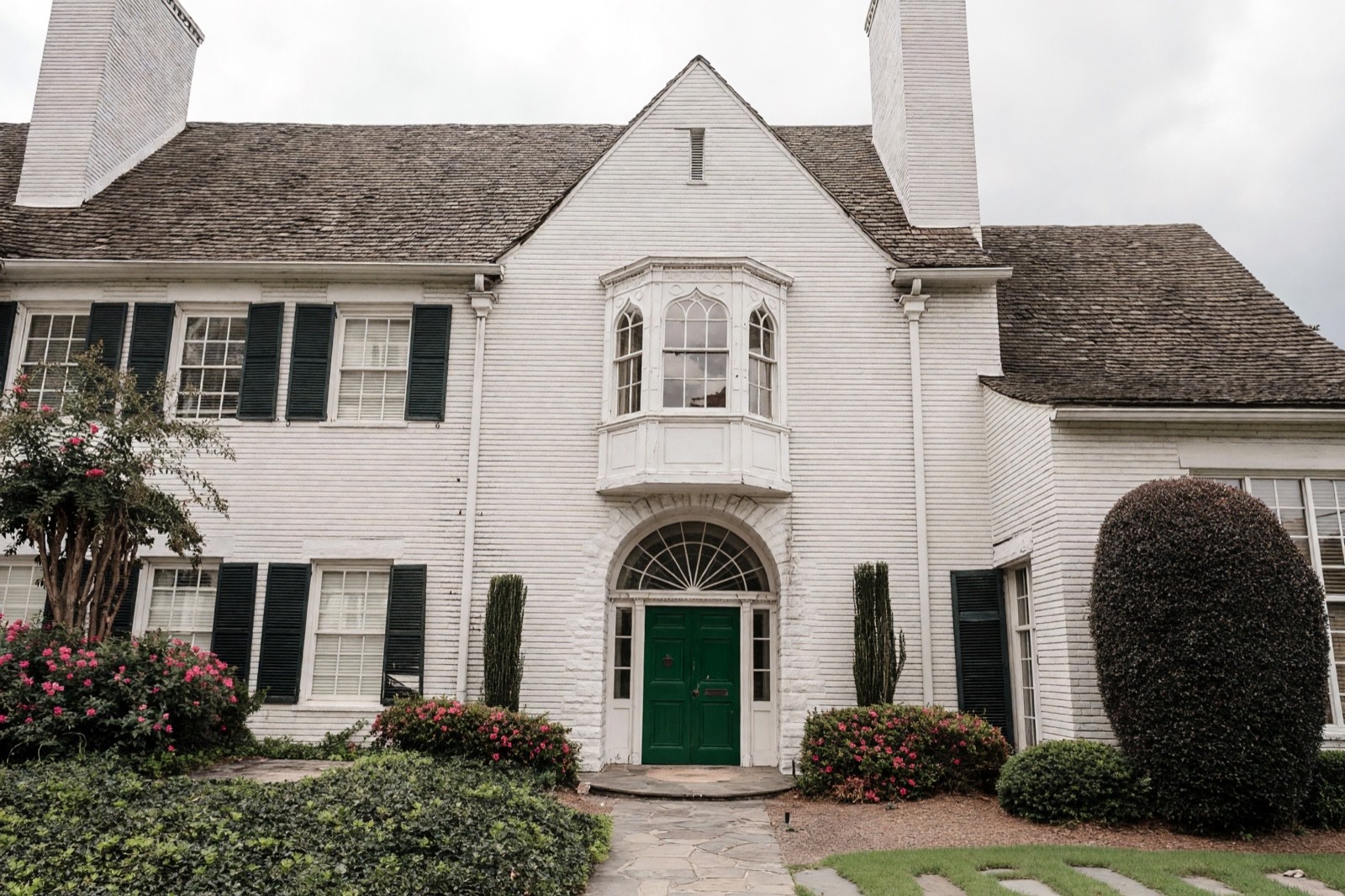
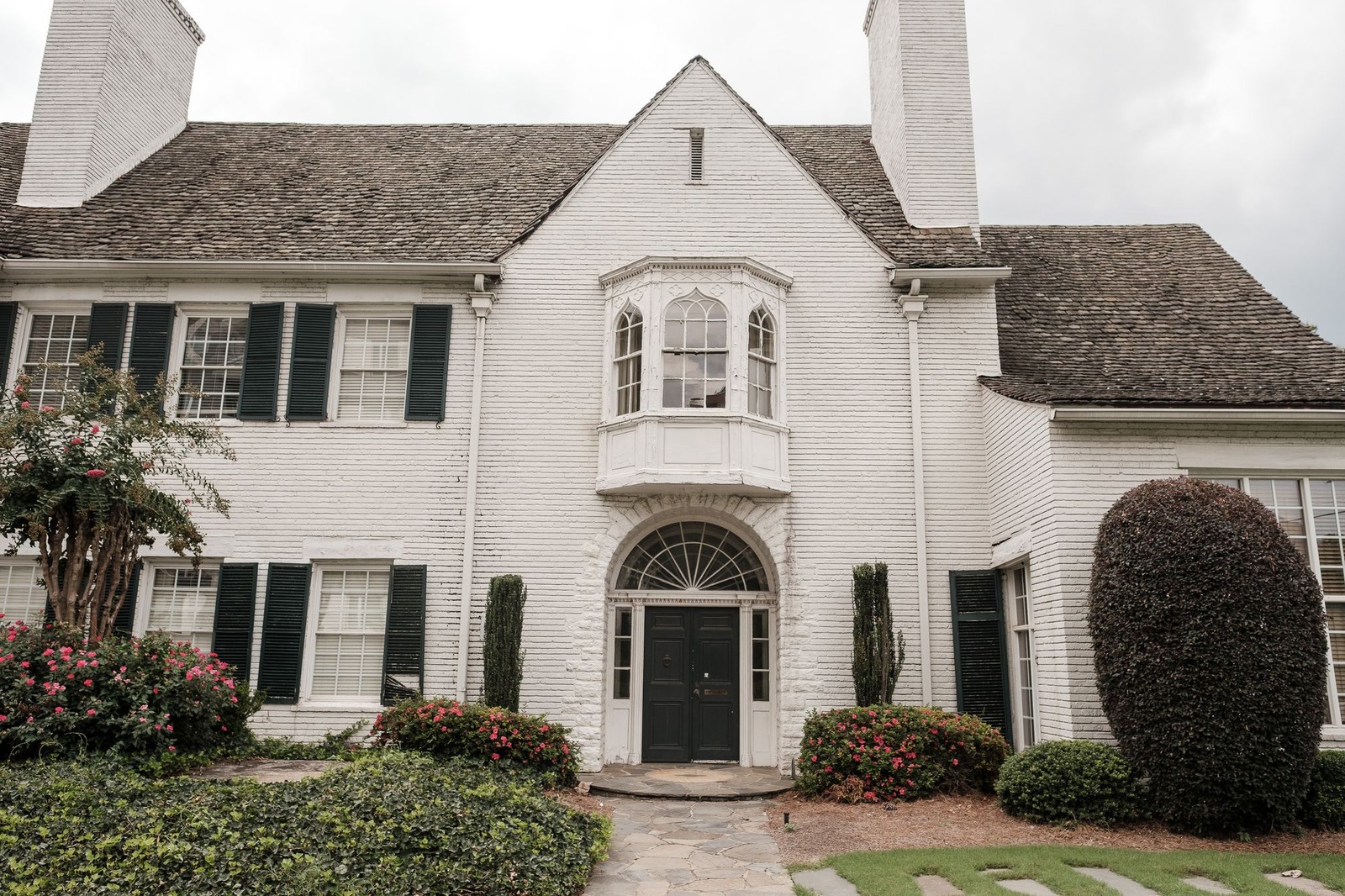
A white house has no color of its own, so a deep green door becomes the one color in the picture. It echoes the clipped shrubs and the dark shutters beside it, which makes it feel planned. Choose a green about as deep as the shutters so the two read as a pair.
2. Rust red against a gray house
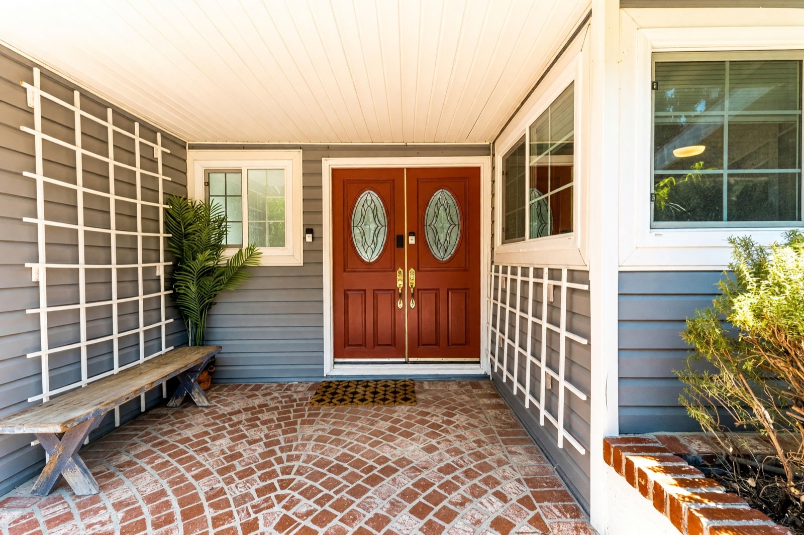
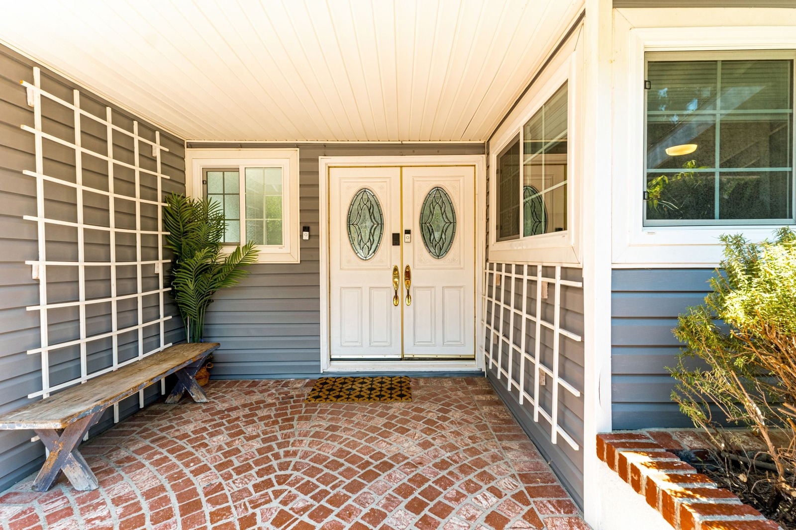
Blue-gray siding is cool and rust red is warm, so the door stands out without being bright. The brick floor already carries a similar red, and the white frame keeps a crisp edge around the door. Under a porch roof a warm red looks deeper than the sample, so test it in the shade.
3. Navy on red brick
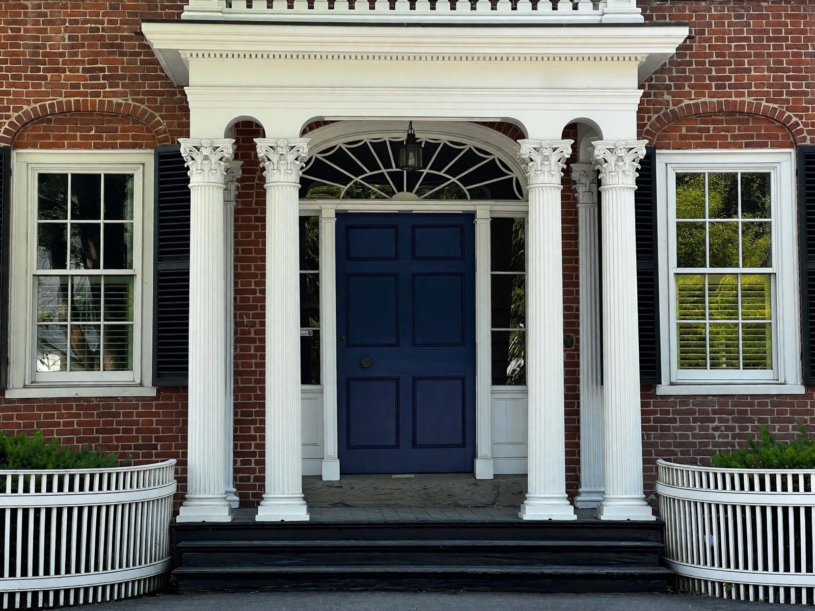
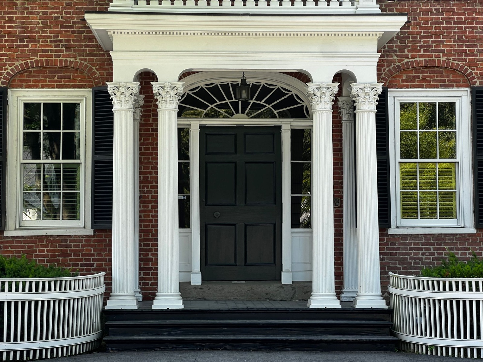
Navy is cool and brick is warm, so the door reads clearly. The white columns and frame do the separating: they keep a dark door from sinking into the brick. In shade navy can look almost black, so choose one with a visible blue in the sample.
4. Soft black on stone and gray siding
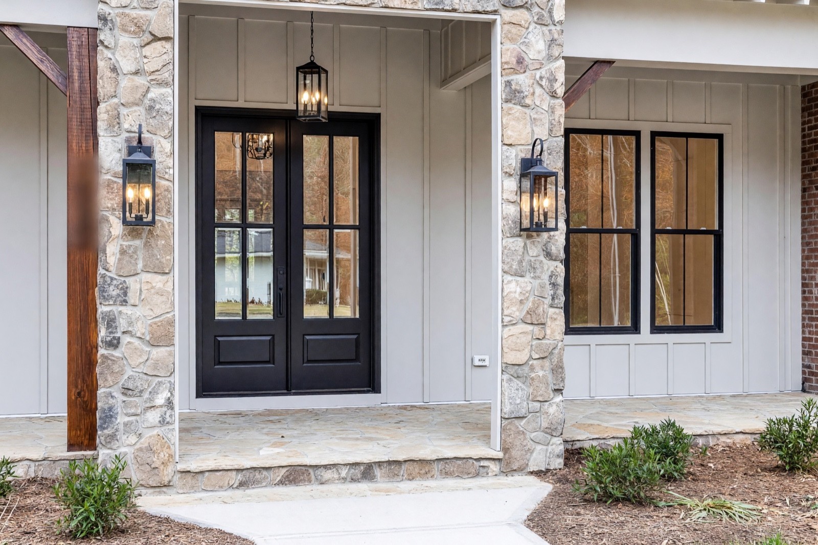
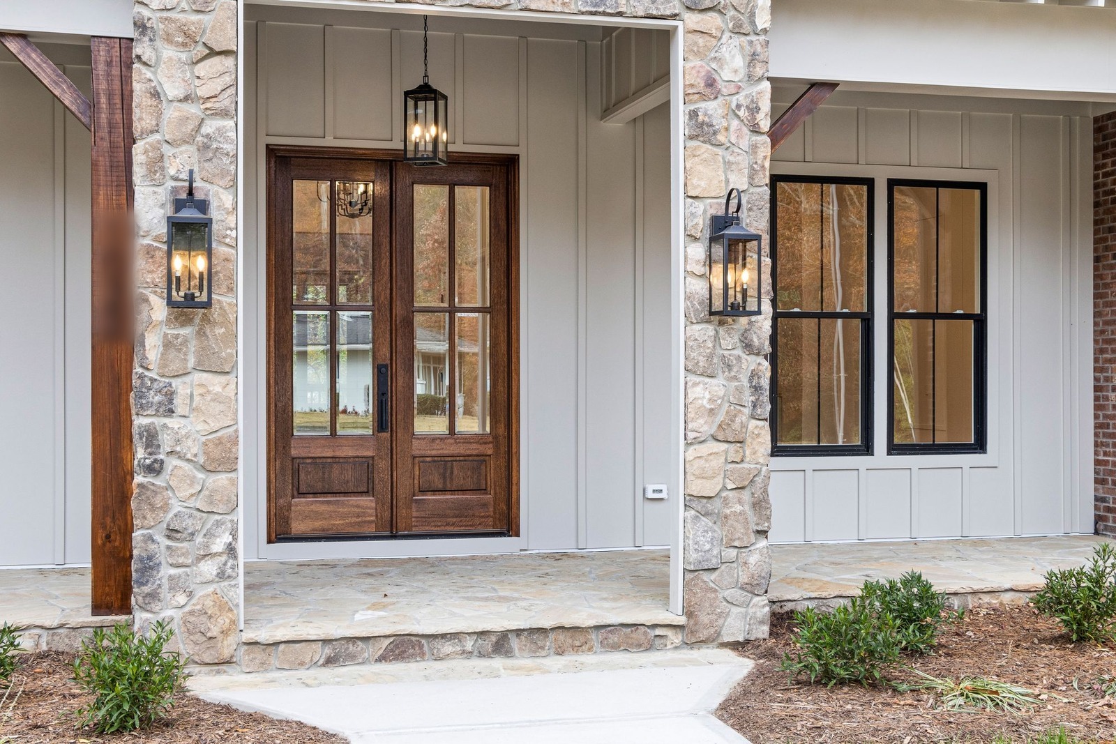
Soft black, a black with a little warmth, ties the door to the black windows and lanterns already on this porch. The stained wood door looked traditional; black makes the entrance quieter and more graphic. Because the frame is painted with the door, the whole unit reads as one dark shape.
5. Ochre yellow on a pale wall at dusk
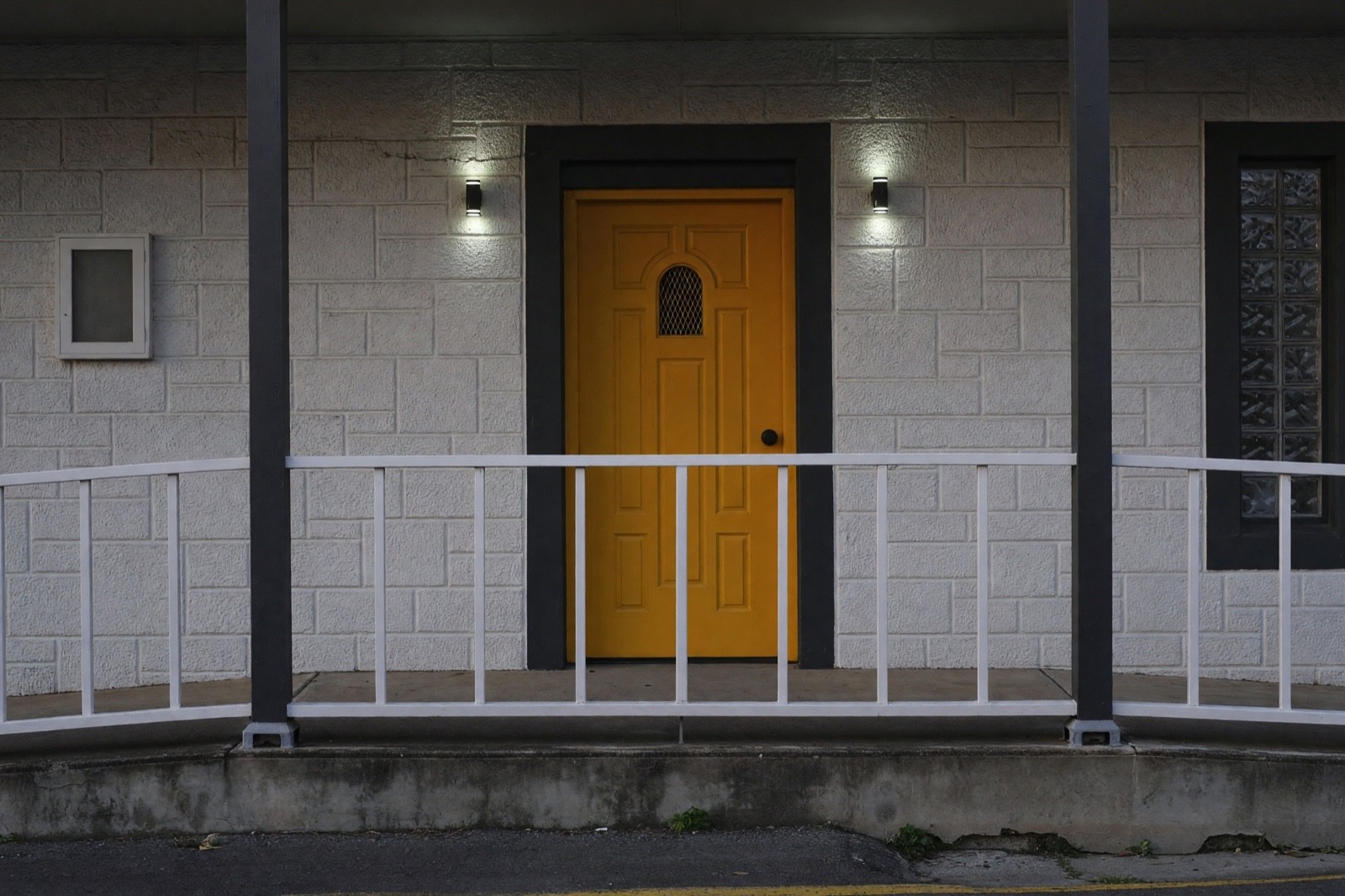
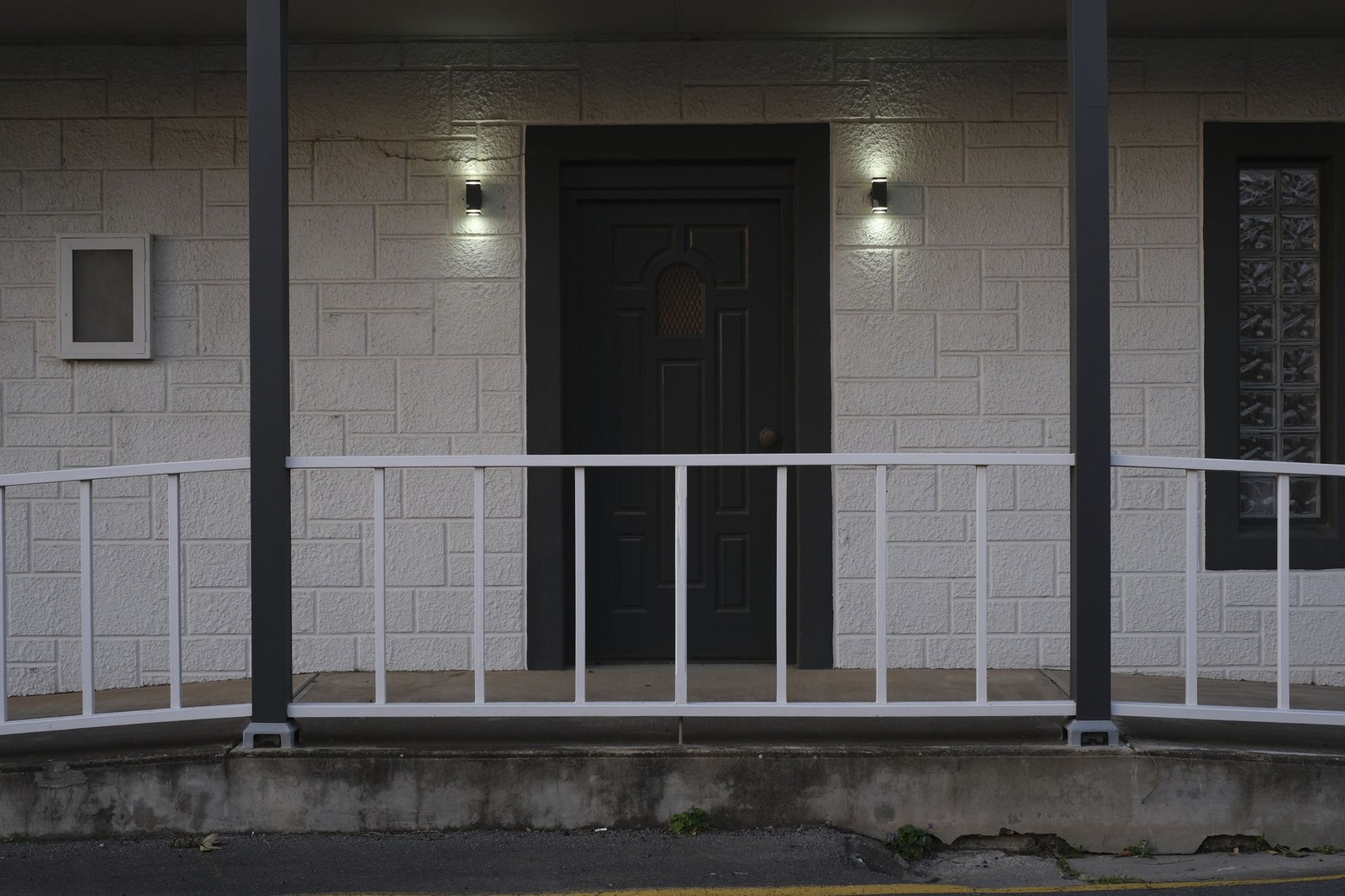
A plain pale wall and a dark surround leave room for one bright door. The dark surround frames the yellow, which is why it looks deliberate and not loud. Ochre is an earthy yellow; a lemon yellow would look sharper. This photo was taken at dusk, so expect the color to look different in daylight.
6. Deep teal on a cream cottage
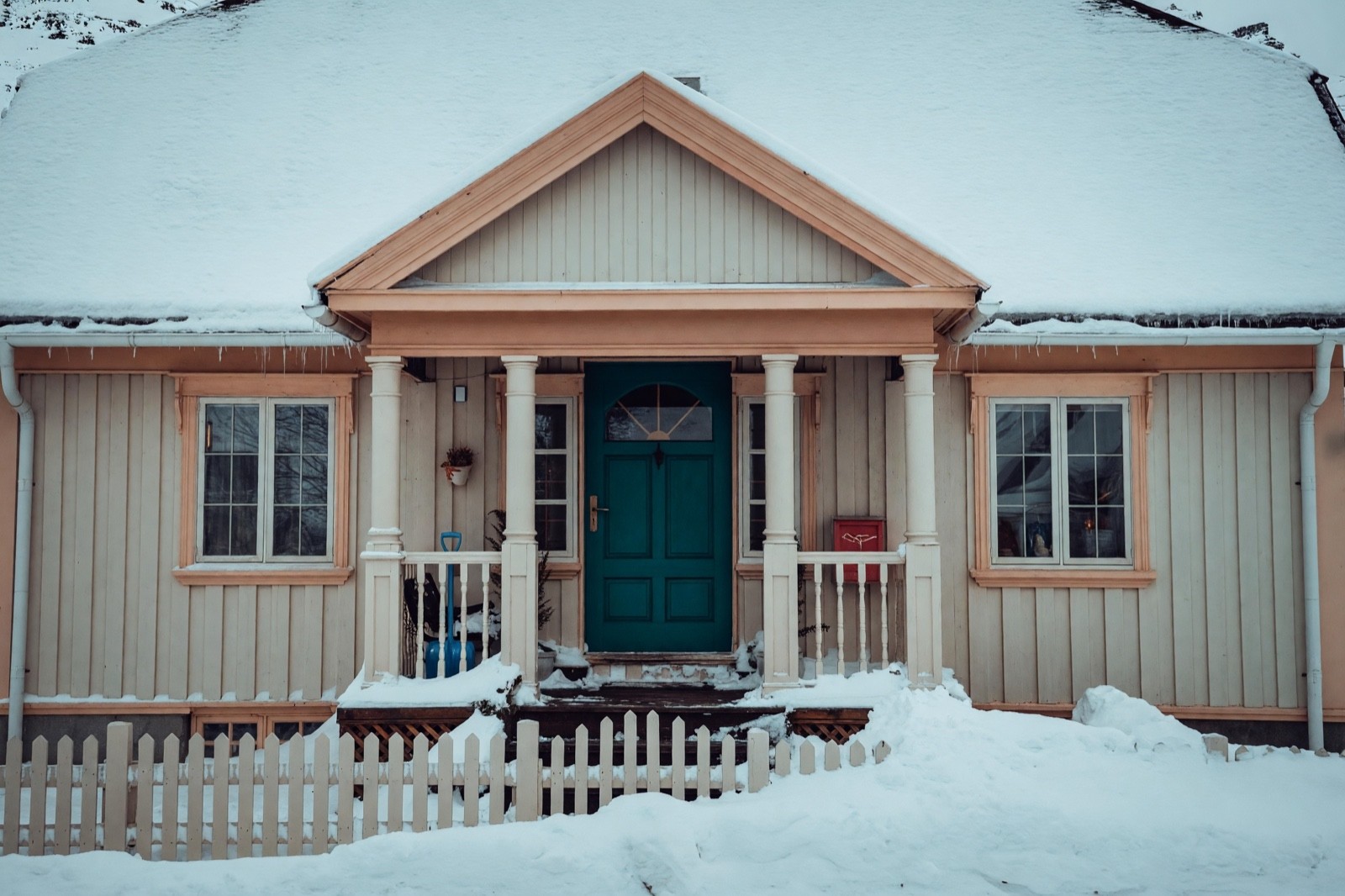
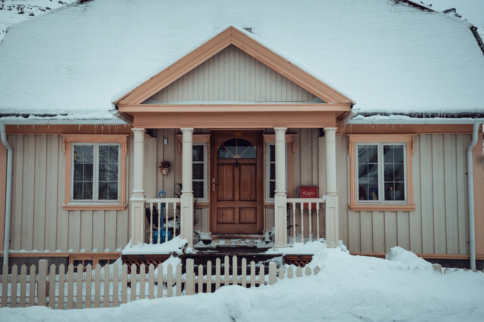
Cream boards and peach trim are warm, so a deep teal door sits opposite them and stands out, while the red mailbox keeps the warm side lively. Painting the frame with the door makes the entrance one block of color. Snow and low light make colors look cooler, so check teal again in summer light.
Front door colors at a glance
| House | Door color idea | Effect | Watch out for |
|---|---|---|---|
| White painted brick | Deep green | Calm, classic contrast | Match its depth to the shutters |
| Blue-gray siding | Rust red | Warm, inviting contrast | Looks deeper in porch shade |
| Red brick | Navy | Cool contrast with warm brick | Can read almost black in shade |
| Stone and gray siding | Soft black | Quiet, graphic, modern | Flat if the porch is dark |
| Pale wall, dark surround | Ochre yellow | One bold accent | Changes a lot from daylight to dusk |
| Cream cottage | Deep teal | Cool accent against warm trim | Looks colder in snow or low light |
Should a front door be lighter or darker than the house?
Either works if the difference looks chosen. A darker door on a light house, like the green, navy and teal examples, frames the entrance and is the easiest to get right. A bright door inside a dark surround, like the ochre one, makes the door the first thing you see. A door close to the wall's tone is the quiet option: a deep gray door on a gray house looks calm and tonal.
The tone to avoid is the one in between. A door only a shade away from the wall or the brick can look like a paint mismatch instead of a decision.
Front door colors for a white house
A white house is a blank page, so the door sets the mood. Deep green, navy and soft black look calm and classic against white. Rust red looks warmer and more inviting. A soft mid-blue is lighter and works best when shutters or trim give the house some contrast. A white door on a white house has little contrast, so it needs a different frame or trim color to read at all. For whole-house palettes with shutters and trim, see house exterior colors.
Front door colors for a gray house
Gray comes warm or cool, so look at the undertone first. A cool blue-gray, like the siding in the second example, suits a warm door such as rust red or ochre. A warm gray suits deep green, navy and soft black. On a modern gray house, a charcoal or black door is a tonal, quiet look; add one warm detail, such as a wood post or a brass number, so it does not feel flat.
Modern front door colors
Modern houses lean on few colors and clean lines, so the door is usually one solid color with plain hardware. Soft black, charcoal, deep green and a natural wood stain suit that. A single bold color, like the ochre example, also works when everything around it is quiet. A satin or matte finish tends to look calmer than high gloss. For a warmer take on the same restraint, see modern farmhouse exterior ideas.
Which front door colors look elegant?
Elegance comes from how a color is used, not from the color alone. Deep, slightly muted colors such as forest green, navy, plum and soft black read as refined because they do not shout. A satin finish, a clean frame and hardware in one metal finish make the door look considered. Contrast helps too: a dark door against pale columns, as in the navy example, looks formal. For more formal facades, see luxury house exterior ideas.
Do front door colors mean anything?
Not in a fixed way, but a color gives a visual impression from the street. Warm colors such as rust red and ochre read as inviting and lively. Deep green and navy read as calm and settled. Soft black reads as formal and strong. These are impressions, not rules, and the same color feels different on brick than on white siding.
If you want the most welcoming door, a warm mid-tone helps, but light, a clear path and tidy plants do as much as the paint.
Classic, calm front door colors
Trends change, but some colors look classic and calm because they come from familiar materials. Navy, deep green, charcoal, soft black and a warm brick red sit quietly beside brick, stone and wood. If your house is sunnier and more colorful, see Mediterranean house exterior ideas for warmer pairings.
Front door colors to be careful with
Any color can work, but three situations tend to look wrong:
- A door that almost matches the wall or brick. A red one shade away from red brick looks like a mistake. Go clearly darker or lighter, or match it exactly.
- A strong color on a house that already has several. If the brick, shutters and roof all carry color, a bright door adds one more voice. Keep the door calm there.
- An undertone that fights the walls. A cold, icy tone beside warm yellow-cream siding can look disconnected. Hold the sample next to the wall and the trim before you decide.
Each of these can work when it is intended and tested in place.
Hardware, lighting and plants around the door
The door is only part of the entrance. Choose the handle, lantern and house number in one metal finish, such as black or brass, so they read as a set, like the black lanterns in the fourth example. Warm bulbs of about 2700 K make wood and warm colors glow in the evening and keep a dark door from looking flat. Pots with green plants soften a strong door color, and a doormat in a tone from the door ties it to the step. For planting beyond the door, see front yard landscaping ideas.
Common front door color mistakes
- Choosing from a small chip. Paint a large sample on the door itself.
- Judging in one light. Look in the morning, at midday and in the evening, with the porch light on.
- Forgetting the frame. Decide whether the frame stays with the walls, stays white or is painted with the door, as in the fourth and sixth examples.
- Ignoring the hardware. A brass handle on a red door and a black one on a navy door look different. Check it with the color.
- Looking only from the step. Check the color from the street, where most people see it.
How to test a front door color
Start on a photo. Take a straight-on daylight picture with the whole door in the frame and try two or three colors as ideas. Then test for real: paint a large board or a patch on the door, and look at it in daylight and in the evening with the lights on. Pick the color that still looks right in the worst light you have, not only the best.
Try front door colors on your own photo
Upload a straight-on photo of your house. To change only the door, use Magic Edit (Pro plan) and describe it in your own words, for example: repaint the front door deep green, and keep everything else as it is. Name the color and what must stay. To see a new look for the whole front of the house, Exterior Design works on the walls, trim and entrance together with its palettes and the Preserve Structure mode, rather than on one door.
If you only want to compare wall colors, Paint recolors the walls and leaves doors unchanged, so it cannot show a new door color.
The result is a design idea, not a paint specification. Screens, photos and AI shift color, and AI can redraw small details near the door, so check them and test a real sample at the door in daylight and in the evening.
Frequently asked questions
What is the best color for a front door?
There is no single best color. Start from your wall color, the brick or stone around the door and the light it gets, then choose a clear contrast, such as deep green or navy on white, or a close tone for a calm look. Test a large sample before you buy paint.
Should the front door be lighter or darker than the house?
Either works if the difference is clear. A darker door on a light house frames the entrance, and a bright door inside a dark surround makes it the focus. Avoid a door that is only a shade away from the wall.
What front door colors suit a white house?
Deep green, navy and soft black look calm and classic against white; rust red and ochre look warmer and more inviting. Check the shutters and trim so the door has a partner.
What are modern front door colors?
Soft black, charcoal, deep green and a natural wood stain suit clean-lined houses, in one solid color with a satin finish. A single bold color also works when the rest of the front stays quiet.
Is it free to try?
Yes. You can start on the free plan, and it includes a limited number of designs.