Kitchen backsplash ideas
A kitchen backsplash is the strip of wall between the countertop and the upper cabinets, and it is often the one place where a kitchen can take a strong color or pattern. Below are six kitchen backsplash ideas shown on real kitchens, before and after, with the types explained in plain words, what each one pairs with and what to check before you buy tile. The pictures show the look only; they are not drawings.
How do you choose a kitchen backsplash?
- Start with the countertop. The backsplash sits right next to it, so one of the two should stay calm. A speckled or veined counter goes with plain tile; a plain counter can carry a pattern.
- Look at the cabinets. White and pale cabinets leave the choice open, from soft gray to deep navy. Dark wood cabinets look lighter next to pale tile and moodier next to a dark one.
- Think about the light. Window light and under-cabinet lights change how a tile reads, and glossy tile shows reflections that matte tile does not. Look at a sample at the time of day you cook.
- Pick the height. A common starting point is from the countertop to the underside of the upper cabinets, often about 45–60 cm (18–24 in). Behind the range, some kitchens carry the tile up to the hood or the ceiling.
- Choose the grout on purpose. Grout close to the tile color gives a calm, almost seamless wall. Lighter or darker grout draws the pattern out, like the rows in the subway tile below.
- Keep to one pattern. If the counter or the floor already has a strong pattern, keep the backsplash plain.
Kitchen backsplash types in plain words
- Subway tile: small rectangles laid in offset rows, like bricks. White and glossy is the classic.
- Zellige and handmade tile: square tiles with an uneven glaze, so the color shifts a little from tile to tile.
- Herringbone: rectangular tiles laid in a zigzag, which adds movement without adding colors.
- Large-format slab or stone-look panel: big pieces with very few joints, so the wall reads as one surface.
- Mosaic: small squares, often in a mix of shades, with many fine grout lines.
- Glass: smooth glass panels or glass tile that reflect the light of the room.
6 kitchen backsplash ideas, before and after
Each example starts from a real kitchen photo with the backsplash wall in view and is shown before and after the AI redraws that wall in Magic Edit from a one-sentence description, with the instruction to leave everything else as it is. The AI can still change small things, so each caption lists the main ones. Small brand labels on the appliances in five of the six before photos were blurred for privacy, and the same spots stay blurred in the after pictures.
1. White subway tile: a classic for a plain wall
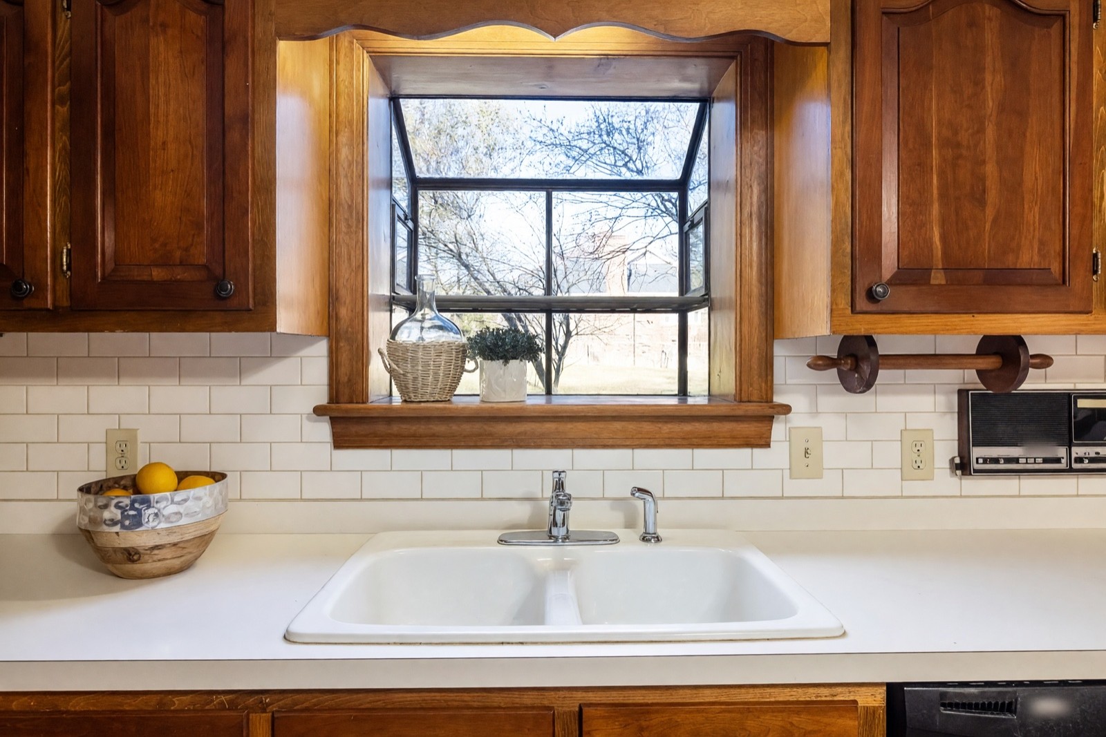
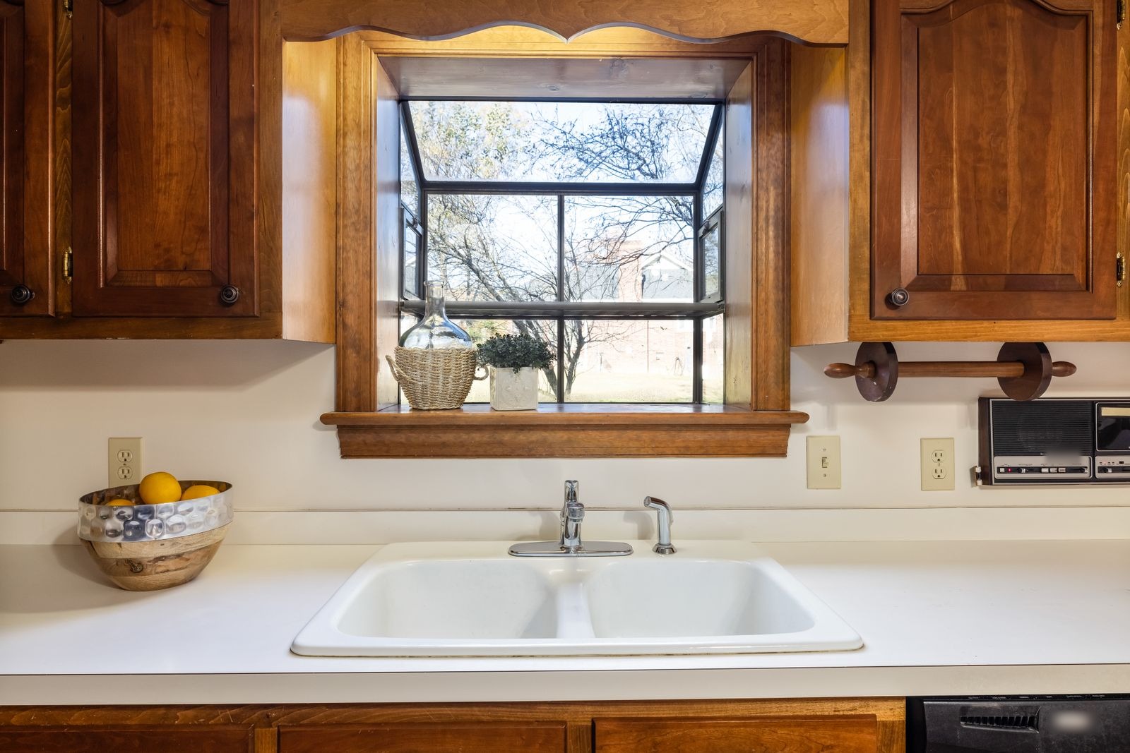
Subway tile is the easy way to give a plain wall some structure. The offset rows and the soft grout lines let the warm wood of the cabinets stay the main feature. The tile meets the window frame and the sill, so measure those edges first: that is where a real installation is decided.
2. Herringbone: movement behind the range
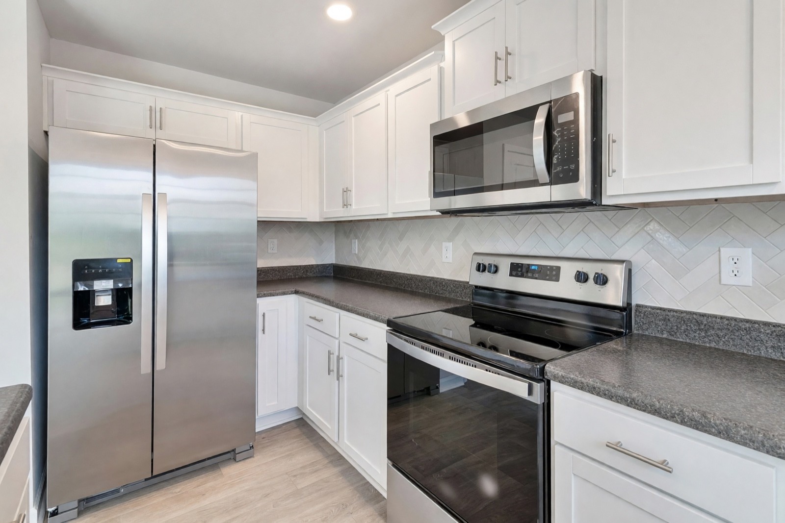
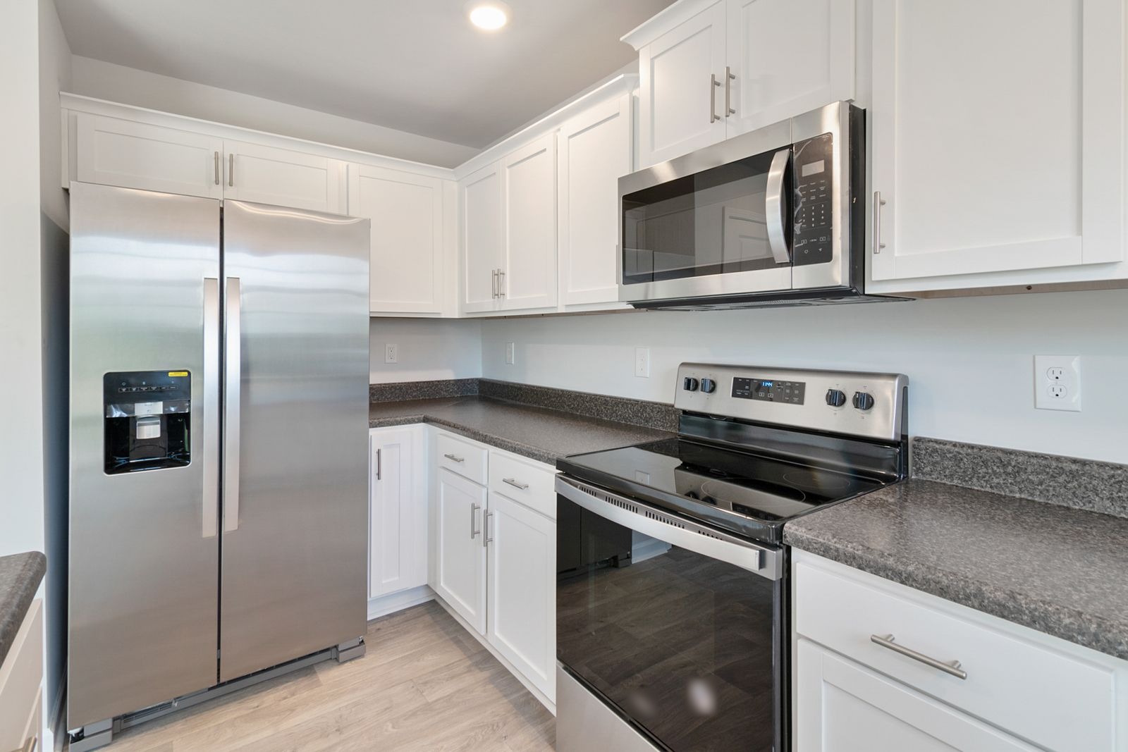
Herringbone adds a zigzag without adding colors, which suits a small kitchen with white cabinets and a dark counter. Keep tile and grout close in tone so the pattern stays calm right behind the range. The pattern also has to turn the corner onto the short wall, so ask an installer how that corner is cut.
3. Sage green zellige: a soft color in a white kitchen
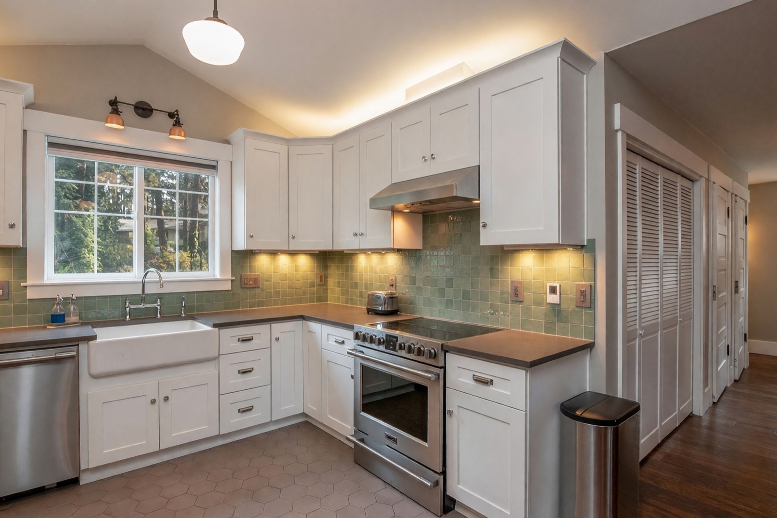
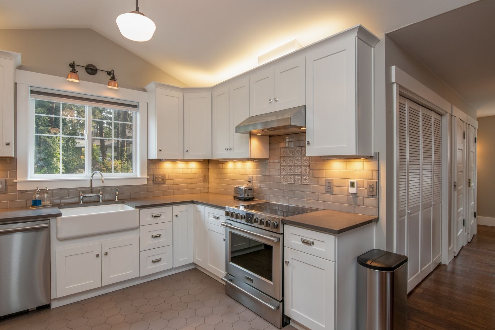
Zellige is handmade, so no two tiles are quite the same shade, and that variation is what makes the wall look alive. Sage green brings color into a white kitchen with a gray counter without shouting. Under-cabinet lights shift the tone, so look at a sample under your own lights before you decide.
4. Cream stone-look slab: one calm surface
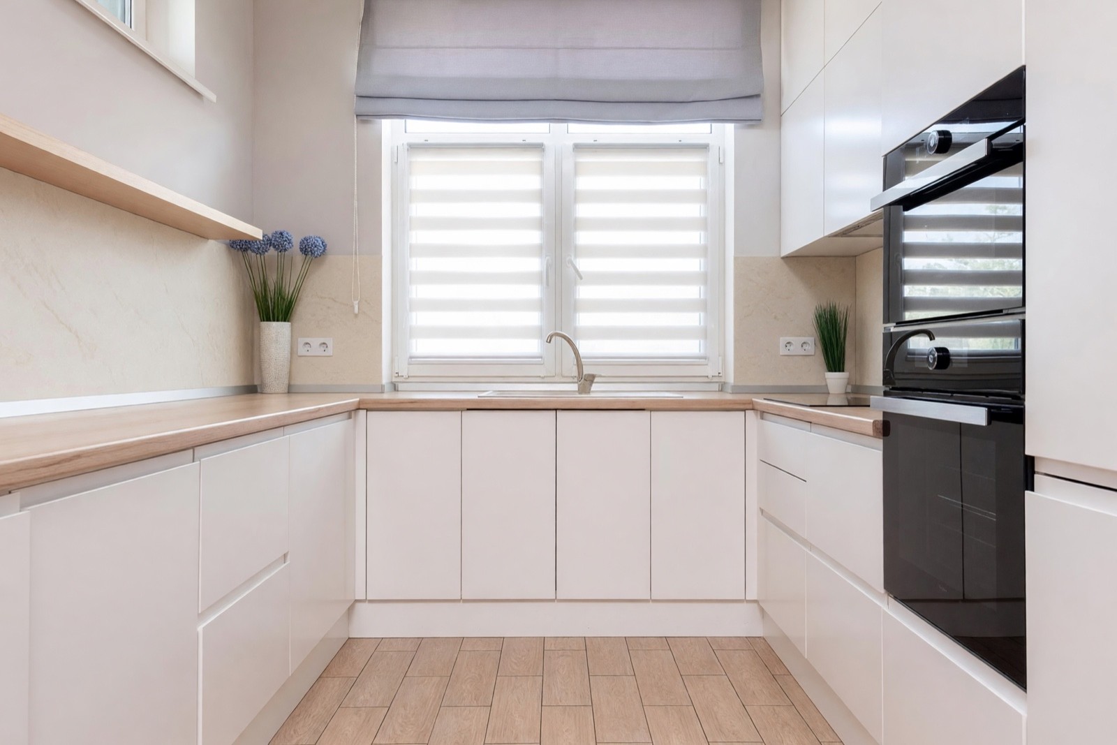
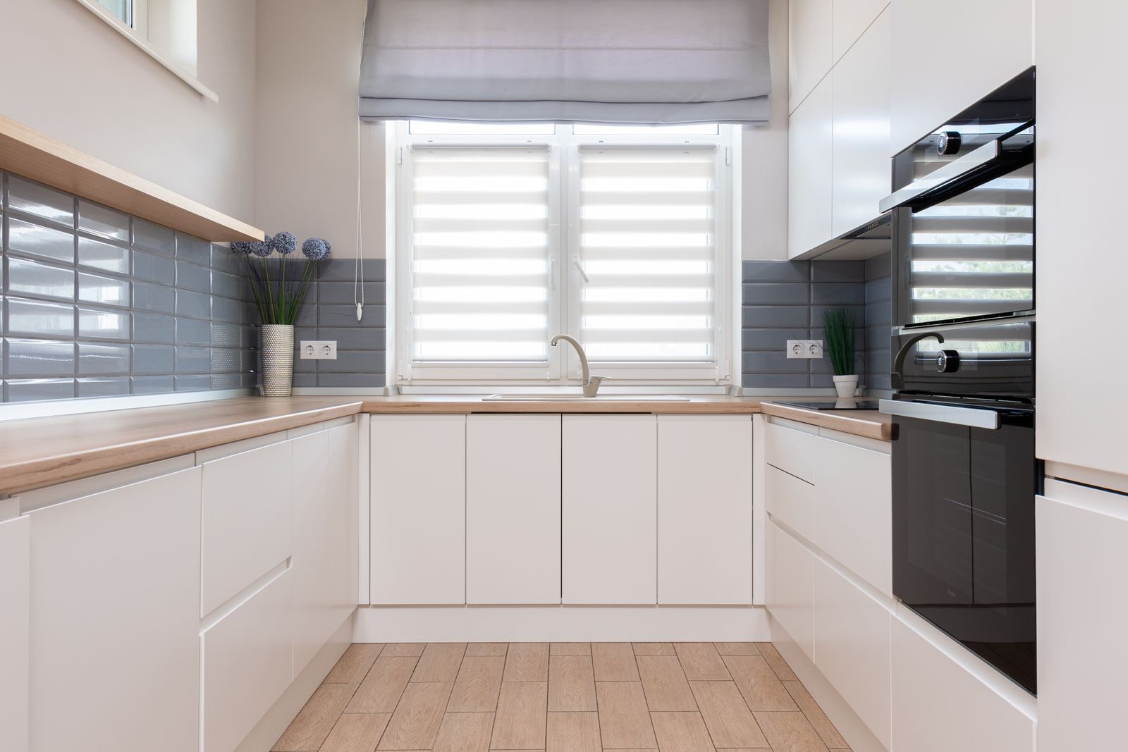
A slab has very few joints, so the wall reads as one surface and the eye goes to the window. Warm cream suits the wood-look countertop here. Slabs are cut to the wall, so ask for a cut plan: where the joints fall, such as the one visible joint in this picture, changes the look.
5. Mixed mosaic: small tiles in a narrow galley kitchen
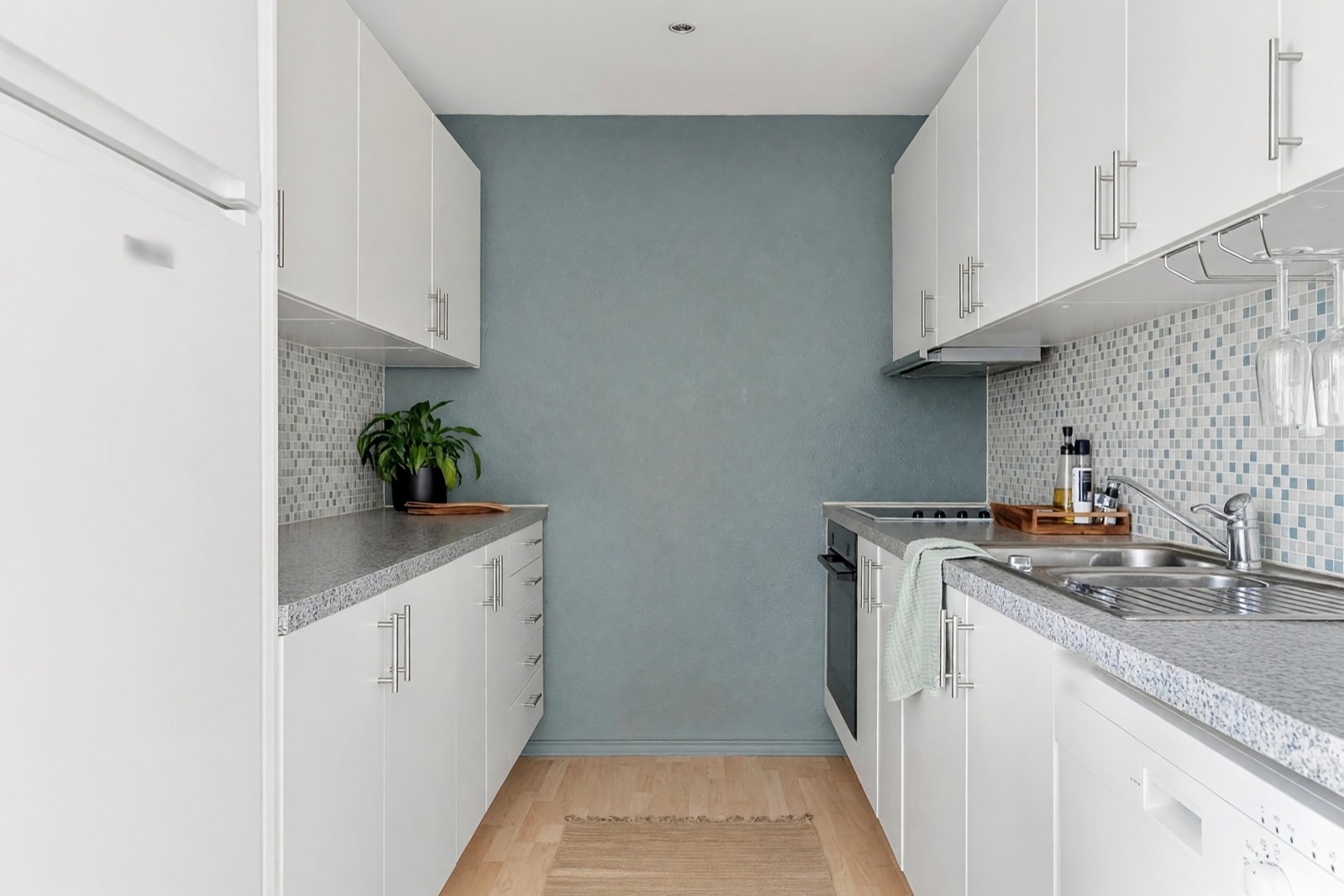
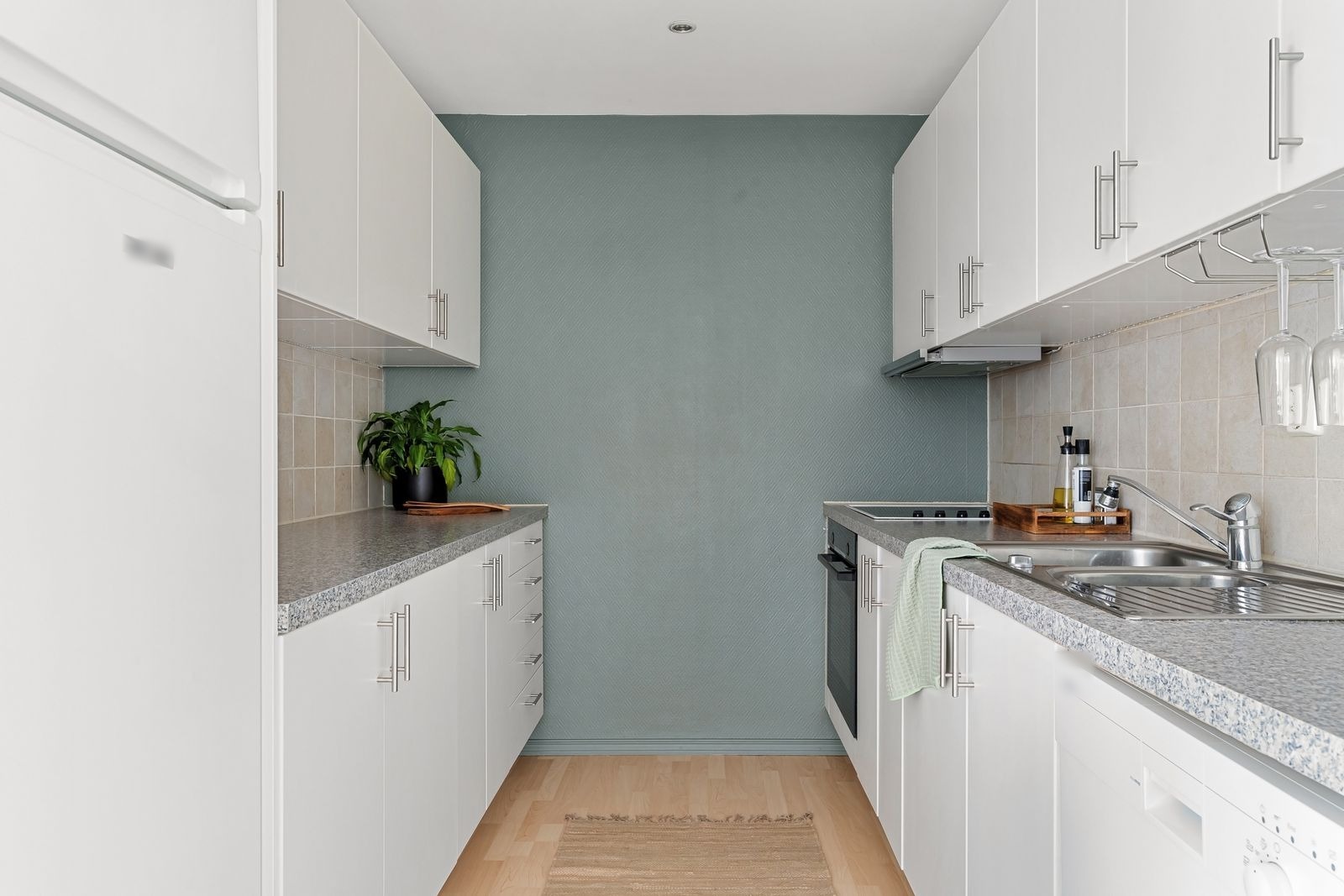
A mix of white, pale gray and soft blue echoes the end wall without matching it. Small tiles turn a plain strip of wall into a pattern, so they work best where the rest of the kitchen is plain, as here. Mosaic means many grout lines, so choose a grout color you are happy to see a lot of.
6. Glossy navy: a deep color between dark cabinets
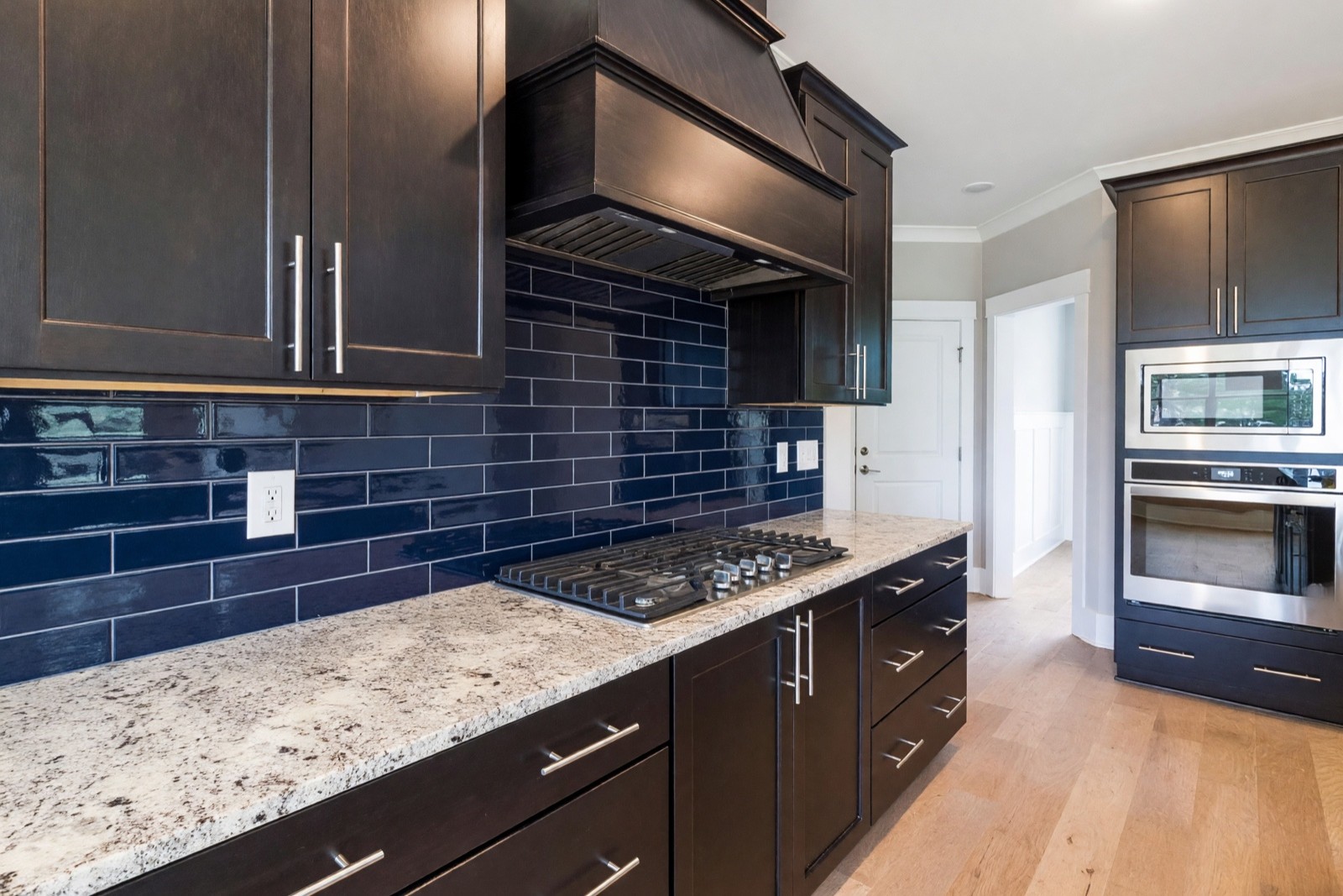
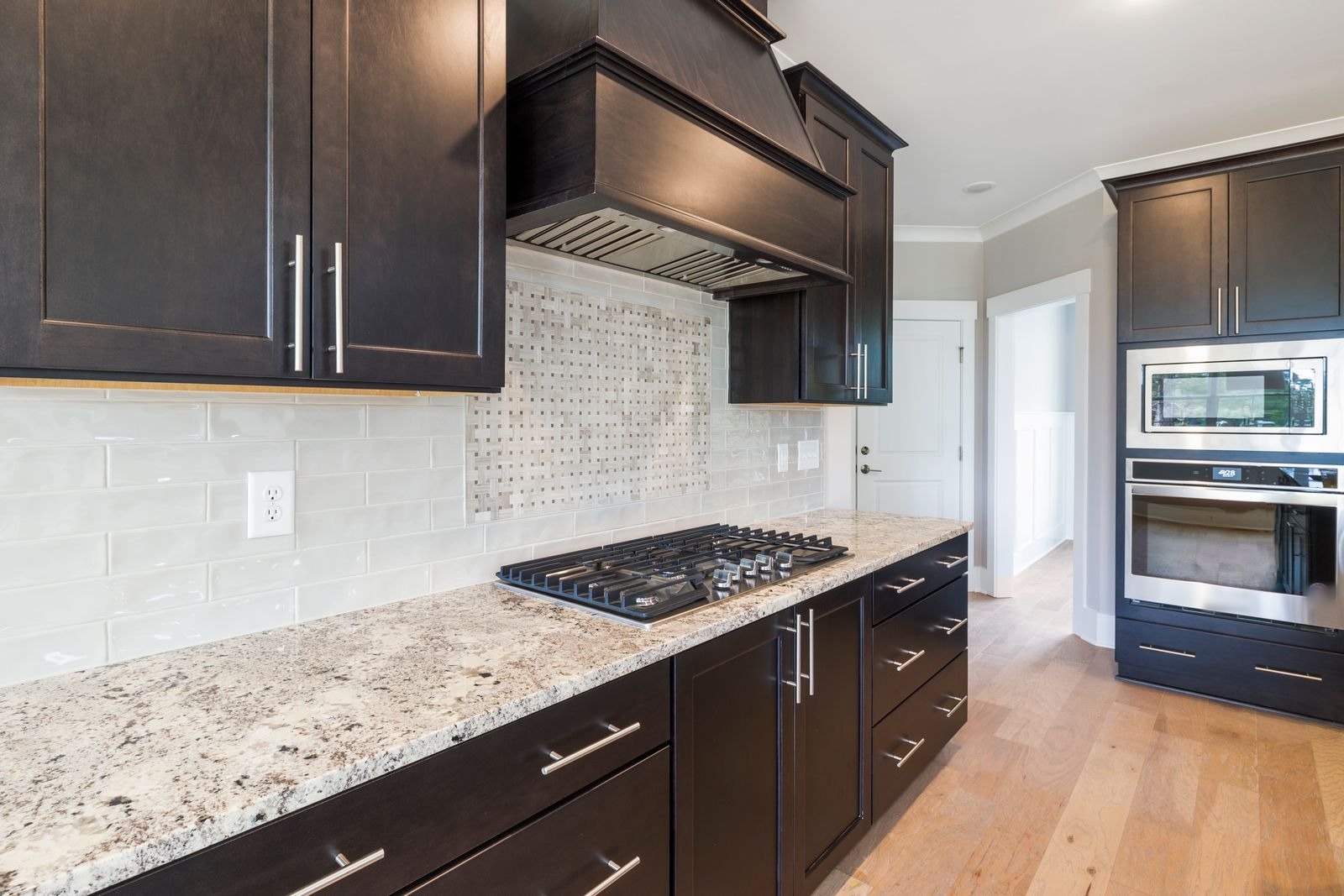
Deep navy gives the pale granite a strong partner and makes the dark cabinets feel richer, and the light counter keeps the mix from getting heavy. Notice the layout: asked for a straight stack, the AI drew a running bond. Check the pattern in every result, because the AI may not follow the layout you describe.
Kitchen backsplash types at a glance
| Backsplash | Pairs well with | What to check |
|---|---|---|
| Subway tile | Wood or painted cabinets, plain or speckled counters | Grout color; how the rows meet the window frame and sill |
| Herringbone | White or pale cabinets, a plain or dark counter | How the pattern turns a corner and meets the range; keep grout close in tone |
| Zellige and handmade tile | White cabinets, gray or stone counters | Color variation from tile to tile; a sample under your own light |
| Large-format slab | Flat-front cabinets, a plain or wood-look countertop | Where the joints fall; the cut plan around outlets and the window |
| Mosaic | Plain cabinets and counters | Many grout lines; busy next to a patterned counter |
| Glossy colored tile | Dark cabinets with a light counter, or white cabinets | Reflections from lights; the layout you actually get |
| Glass | Plain, flat-front cabinets | What the glass will reflect; how it meets outlets and edges |
What is the best type of backsplash for a kitchen?
There is no single best type; the right one depends on the spot and on how much you cook. Ceramic and porcelain tile are the usual all-rounders, because a damp cloth cleans them and only the grout needs some care. Other materials trade looks for upkeep:
- Ceramic or porcelain tile: easy to wipe, available in almost any size, color and finish.
- Glass: smooth, with few places for grease to hide, and it reflects light.
- Natural stone: a rich look, but it usually needs sealing and some care with acidic spills.
- Metal: wipes clean, but shows fingerprints and can scratch.
- A painted or sealed wall: can work where little water splashes, for example beside a window.
Backsplash color and style questions
Should a backsplash be lighter or darker than the countertop?
Neither is a rule, because both approaches work. A backsplash that contrasts with the countertop becomes a feature, like the navy beside the pale granite in example 6. One close in tone to the counter reads calmer and makes the kitchen feel more continuous. If the countertop is veined or speckled, keep the backsplash quiet whatever its tone. Hold a sample against the counter in your own light and look at it from across the room.
Which backsplash colors go with white cabinets?
White cabinets work with almost anything, so the countertop and the mood you want decide. Sage or soft green and blue-gray feel fresh, as the sage zellige in example 3 shows. Warm tile in cream or sand softens the white, and a wood tone nearby, such as open shelves or a wood-look counter, adds warmth. For a stronger look, a patterned tile in one area, such as the herringbone behind the range in example 2, adds interest while the rest of the kitchen stays plain.
Which backsplash never goes out of style?
Nothing is guaranteed to stay in style, but simple and neutral choices tend to age slowly. Plain white or off-white tile, subway-shaped tile in an offset layout and calm natural tones have been used in kitchens for a long time. Strong colors, busy patterns and unusual shapes are easier to tire of, although they are also the ones you may love most. A neutral backsplash lets you change the mood later with paint, cabinet hardware and textiles.
What is trending in kitchen backsplashes in 2026?
Trends differ by region and move slowly, so take this as a direction rather than a rule. Looks that keep showing up in recent kitchens include:
- Large-format panels or a slab that runs up to the cabinets or higher, with few joints, as in example 4.
- Handmade-look tile with an uneven glaze, like the zellige in example 3.
- Warm neutrals and soft earthy greens next to, or instead of, cool gray.
- Simple stacked or offset layouts instead of complicated patterns.
See modern kitchen design ideas for how these fit a whole-kitchen look.
Backsplash behind the stove
The wall behind a cooktop takes heat, steam and grease, so choose a material made for that spot and easy to wipe. Glazed ceramic and porcelain tile, glass and metal are common choices; for anything else, read the maker's guidance for use near a cooktop. Fewer joints mean less grout to scrub, which favors large tiles and slabs, and a mid-tone grout hides splashes better than a white one. How far the cooktop, hood and wall surface must be from each other is set by local building rules and the appliance maker, so ask a professional. Example 2 puts herringbone behind the range: it shows the look, not whether the tile suits the heat.
Kitchen backsplash ideas on a budget
You can keep a backsplash affordable by changing how much wall you cover or how complicated the job is, not by settling for a look you do not like. Common ways to do it:
- Tile only the splash zone: a few rows along the counter, or just behind the sink and the cooktop, and paint the rest of the wall.
- Choose simple tile: plain shapes in a straight or offset layout are quicker to lay than herringbone or mosaic, which need more cuts.
- Paint and seal the wall: for a spot away from the sink and the cooktop, with a paint made for kitchens and a protective finish. Check the maker's guidance.
- Try peel-and-stick tiles: stick-on products suit some situations, such as a short wall away from the cooktop, a rental or a temporary refresh. They are usually not the right choice right behind a cooktop, where heat and grease can loosen the adhesive.
Test each option on a photo of your kitchen first; the AI kitchen design guide shows how to try one decision at a time.
Backsplash ideas for a small kitchen
In a small kitchen, a light tone, larger tiles and fewer lines keep the wall calm and the room open. Light tile bounces window light around, larger tiles leave fewer grout lines for the eye to count, and grout close to the tile color keeps the surface quiet. A small kitchen can still take a strong color in one place, such as behind the range or the sink. Small mosaic tiles, as in example 5, add many lines, so they work best when the cabinets and counters are plain.
Other ways to try a backsplash in HomeCompose
Color & Texture (Essential and Pro plans) works the other way round: you select the backsplash on your photo, then choose a material. Backsplash is one of the objects it can find in a kitchen photo, and you can also paint the area with the brush. The tile and stone choices include Subway tile, Zellige, Mosaic, Herringbone tile, Hexagon tile, Penny tile, Fish scale tile, Cement tile, Glossy tile, Porcelain slab, Marble-look porcelain, Marble, Travertine and Limestone, and Back-painted glass is in the Glass group. Each material has one preset look, so use Magic Edit when you want to say how large the tile is, which way it runs or what color the grout is.
Interior Design restyles the whole kitchen. Set the room to Kitchen and choose a mode: with Structural Preservation the walls, windows and layout stay while furniture, lighting, decor and finishes are refreshed in one style. It does not let you pick the backsplash itself, so use it for the overall look. See modern kitchen ideas for whole-kitchen makeovers and kitchen island ideas for islands and stools. If the wall color is the question, try it first in Paint, which repaints flat walls only. To try a different cabinet color or finish, select the cabinets in Color & Texture (Essential and Pro plans) or describe the change in Magic Edit (Pro plan). If the wall next to the kitchen needs a change, see wall paneling ideas.
What to check before you buy tile
The pictures show the look only. They are not drawings, and they say nothing about how a material behaves in a kitchen, so ask your supplier or installer about the material for the place it will go.
- Measure around everything on the wall: outlets, switches, the window, the range hood and the underside of the cabinets decide how many tiles you need and where the cuts fall.
- Check the wall: a straight tile line in a picture needs a straight wall, and an installer checks that before tiling.
- Plan the edges: where the tile stops at a window, a corner or the cabinets is what makes it look finished.
- Name every wall section when you describe it: in this set, the first result for the herringbone kitchen tiled only the long wall, so the short wall by the refrigerator was named in the second try.
- Expect nearby changes: the AI may redraw cabinets, counters, appliances or hardware next to the new backsplash, so compare the pair closely.
Common kitchen backsplash mistakes
- Competing patterns. A busy backsplash on top of a veined counter and a patterned floor makes the wall hard to read.
- Ending the tile at an awkward line. Stop it at the cabinets, a window frame or a clear corner, not in the middle of a wall.
- Choosing the color alone. Hold the sample next to the counter, the cabinets and the floor in your own light.
- Forgetting the grout. The grout color changes how the same tile reads.
- Judging from one small sample. Look at a larger piece on the wall before you decide.
Try a backsplash on your own kitchen photo
Photograph the backsplash wall straight on, in daylight, with the countertop edge and the underside of the cabinets in view. Upload it to Magic Edit (Pro plan) and describe the change in one sentence: what the new backsplash is made of, its color, the layout and the grout, which wall sections it covers and what must stay, for example "replace only the wall between the countertop and the upper cabinets with white subway tile and light gray grout, and keep the cabinets, counters and appliances exactly as they are". For more rooms and styles, see the HomeCompose design ideas page.
Frequently asked questions
How high should a kitchen backsplash go?
A common starting point is from the countertop to the underside of the upper cabinets. Behind a range, some kitchens run the tile up to the hood or the ceiling for a stronger look. Measure your own wall and compare both heights on a photo before you decide.
What backsplash goes with white cabinets?
White cabinets leave the choice open. Plain white subway tile is the quiet option, while sage green, navy or a herringbone pattern is a stronger one. Decide by the countertop first, since the backsplash sits right next to it.
Should the grout match the tile?
Grout close to the tile color gives a calm, almost seamless wall. Lighter or darker grout draws out the pattern, which suits subway tile and herringbone. Look at both on your own photo before you choose.
Can I see a backsplash on my own kitchen before I buy tile?
Yes. Upload a photo to HomeCompose and describe the backsplash in Magic Edit (Pro plan), or select the backsplash in Color & Texture (Essential and Pro plans) and choose a material. The result shows the look only, so measure around outlets, the range hood and the window before you order.
Is it free to try?
Yes. You can start on the free plan, and it includes a limited number of designs.