Living room paint colors
The best living room paint color works with the sofa and floor you already have and suits your light. Below are six living room paint colors shown on real rooms, before and after, with the furniture and floor each one pairs with, and what to check before you buy paint.
How do you choose a living room paint color?
- Start from what stays. The sofa, the floor and the curtains will not change, so choose a wall color that works with their tones before you look at any chip.
- Think about the light. A room with big windows can take a deep color; a room with little daylight usually looks best in a light, warm one.
- Pick a mood. Soft greens and blues feel calm, warm yellows and terracotta feel social, and deep teal or navy feel dramatic.
- Look at the undertone. Hold the sample next to your floor. A cool blue next to warm brown leather looks fresh; the same blue next to gray upholstery on a gray floor looks cold.
- Keep the ceiling and trim light. White trim and a white ceiling frame the walls and keep a strong color from closing the room in.
- Use a matte or soft finish. It hides small wall flaws and looks calm in daylight and lamp light.
6 living room paint colors, before and after
Each example starts from a real photo, shown before and after AI repaints the walls with a color from the Paint color list. Paint is told to change only the plain wall surfaces, but AI can change small details, such as adding a thin molding at the ceiling edge, so treat every result as an idea and test a sample on your own wall.
1. Eucalyptus: fresh green with a gray sofa and oak floor
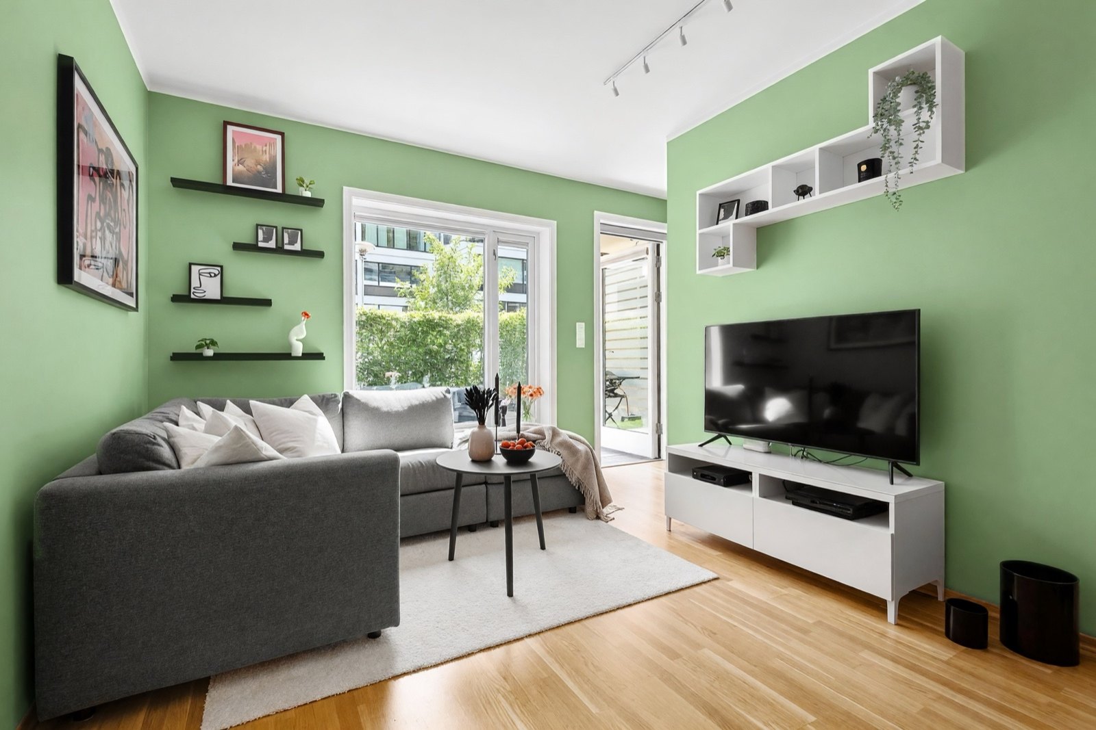
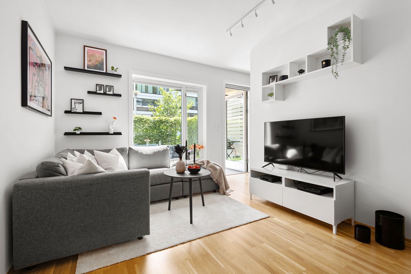
Green and oak are a natural pair, and gray upholstery sits quietly between them. Because the TV unit, the wall shelf unit and the rug are white, the green reads as the main color in the room.
2. Ochre: a warm yellow against a dark gray sofa
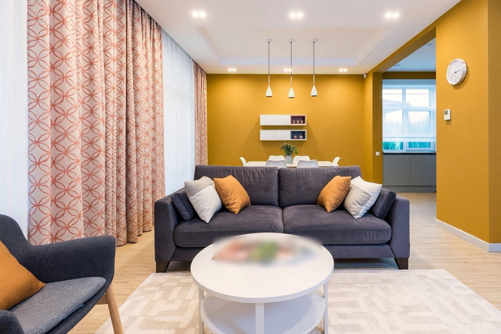
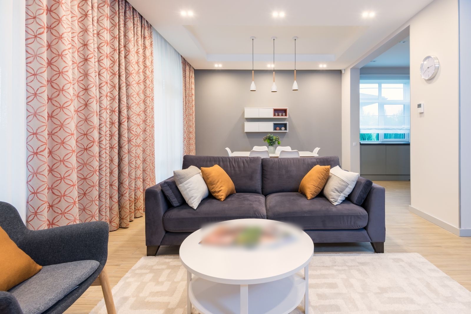
Warm yellow and a cool dark sofa balance each other, which is why the mustard cushions already work. The ochre walls make the open dining area feel like part of the living room. Keep the curtains simple if you copy this look.
3. Mist blue: a cool backdrop for warm brown
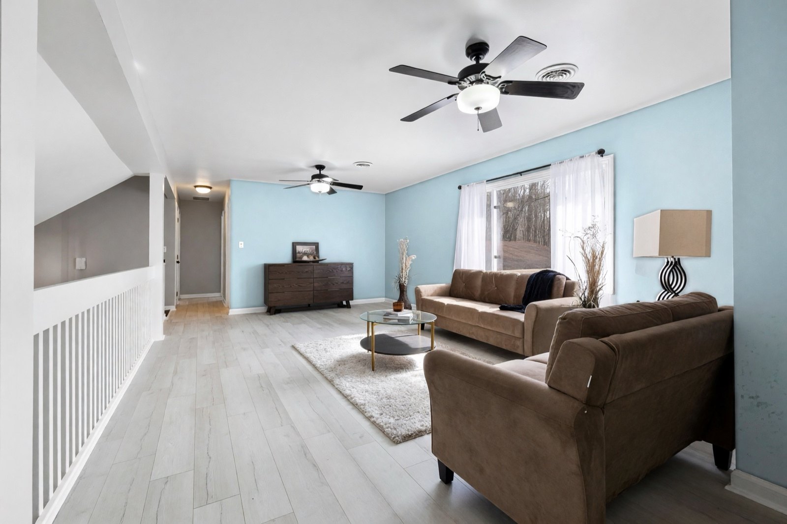
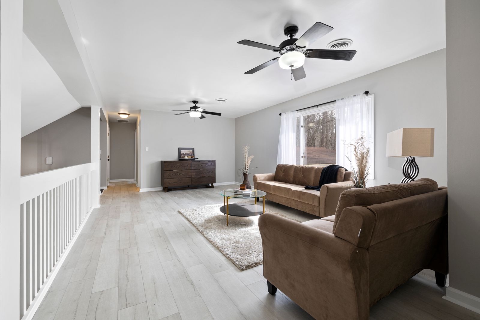
A pale blue is a calm backdrop for brown leather and velvet. Light gray wood floors keep the room airy. Because the stairwell wall stays gray here, the walls read as two tones; paint every wall if you want a single color.
4. Terracotta: a bold wall color for a gray room
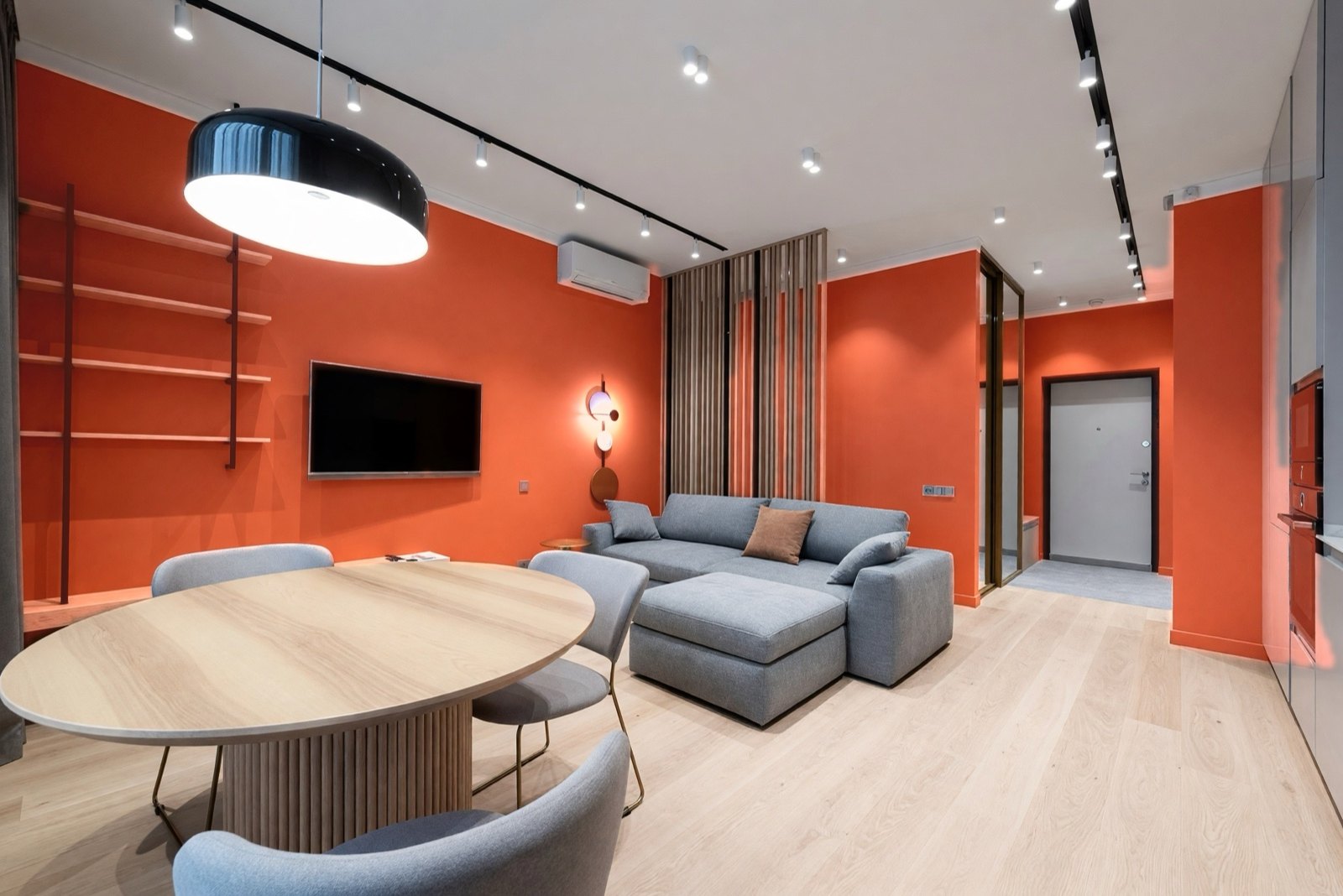
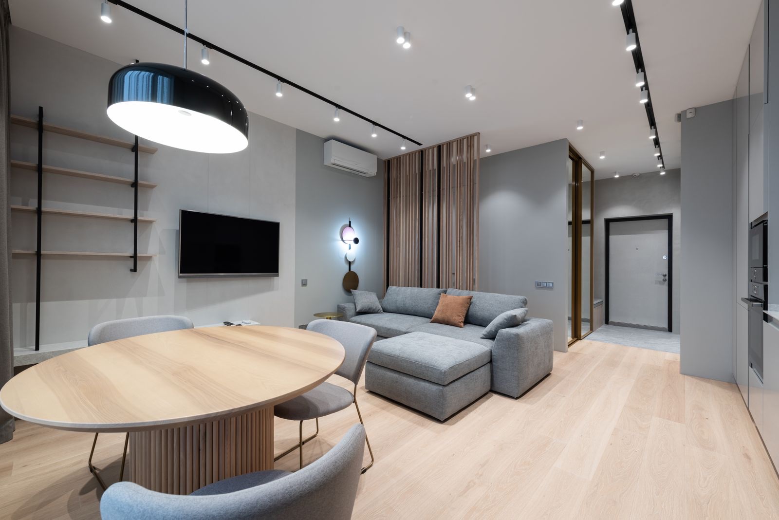
Terracotta turns a neutral gray room into a warm, social space. The pale oak floor and gray sofa stay quiet so the walls can lead. This is a strong color, so it suits a room with good daylight and bright lighting.
5. Teal: deep color in a bright, empty room
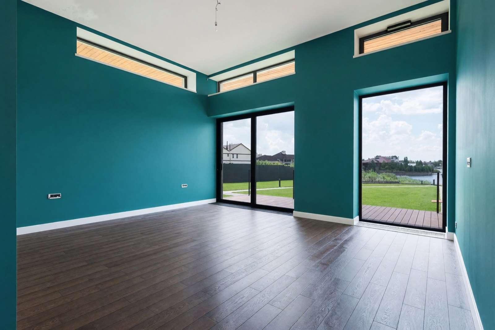
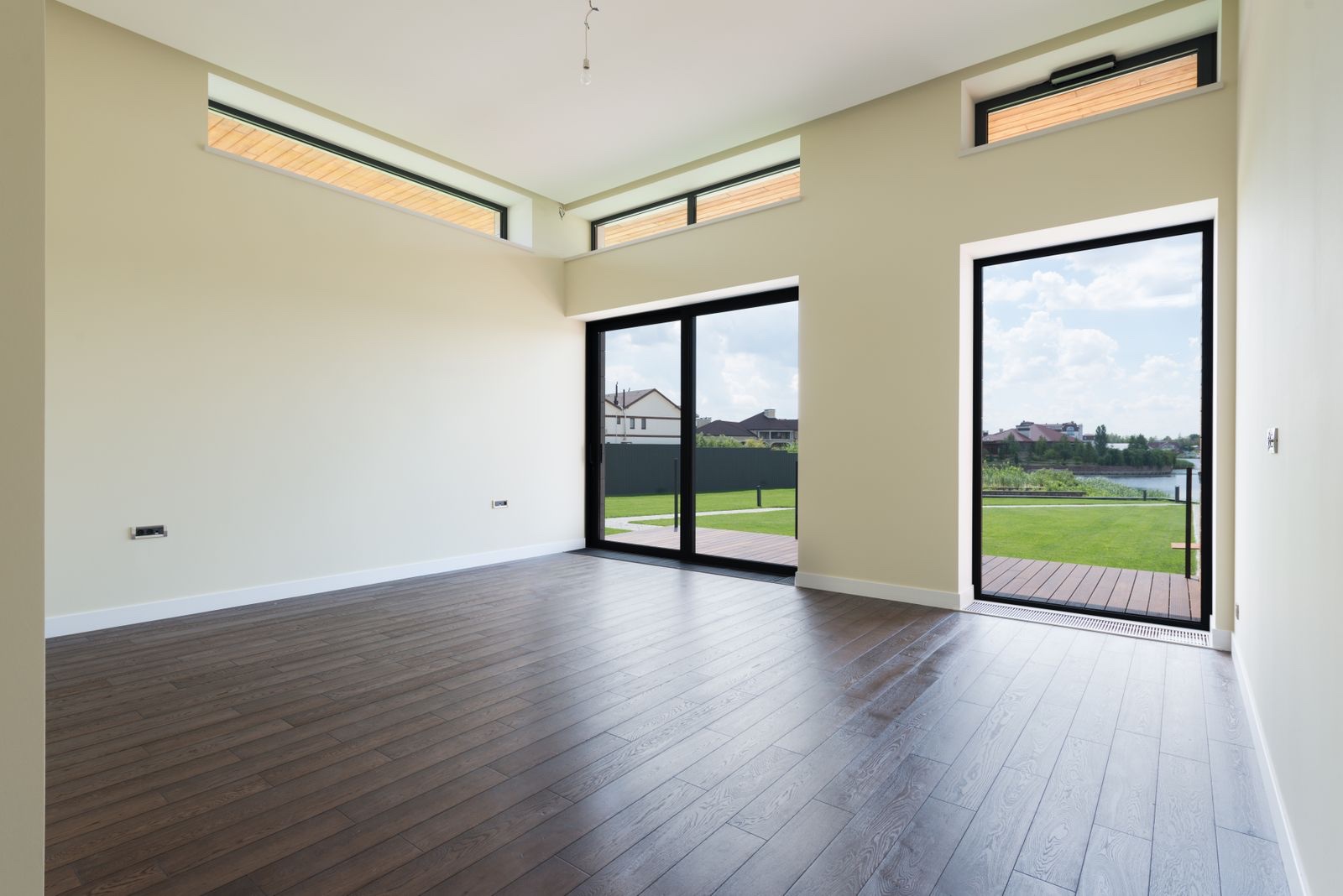
A deep teal needs light, and this room has plenty: two large glass doors and three high windows. White baseboards keep the edge crisp. In a smaller room, use teal on one wall only.
6. Blush: a soft pink for an empty room
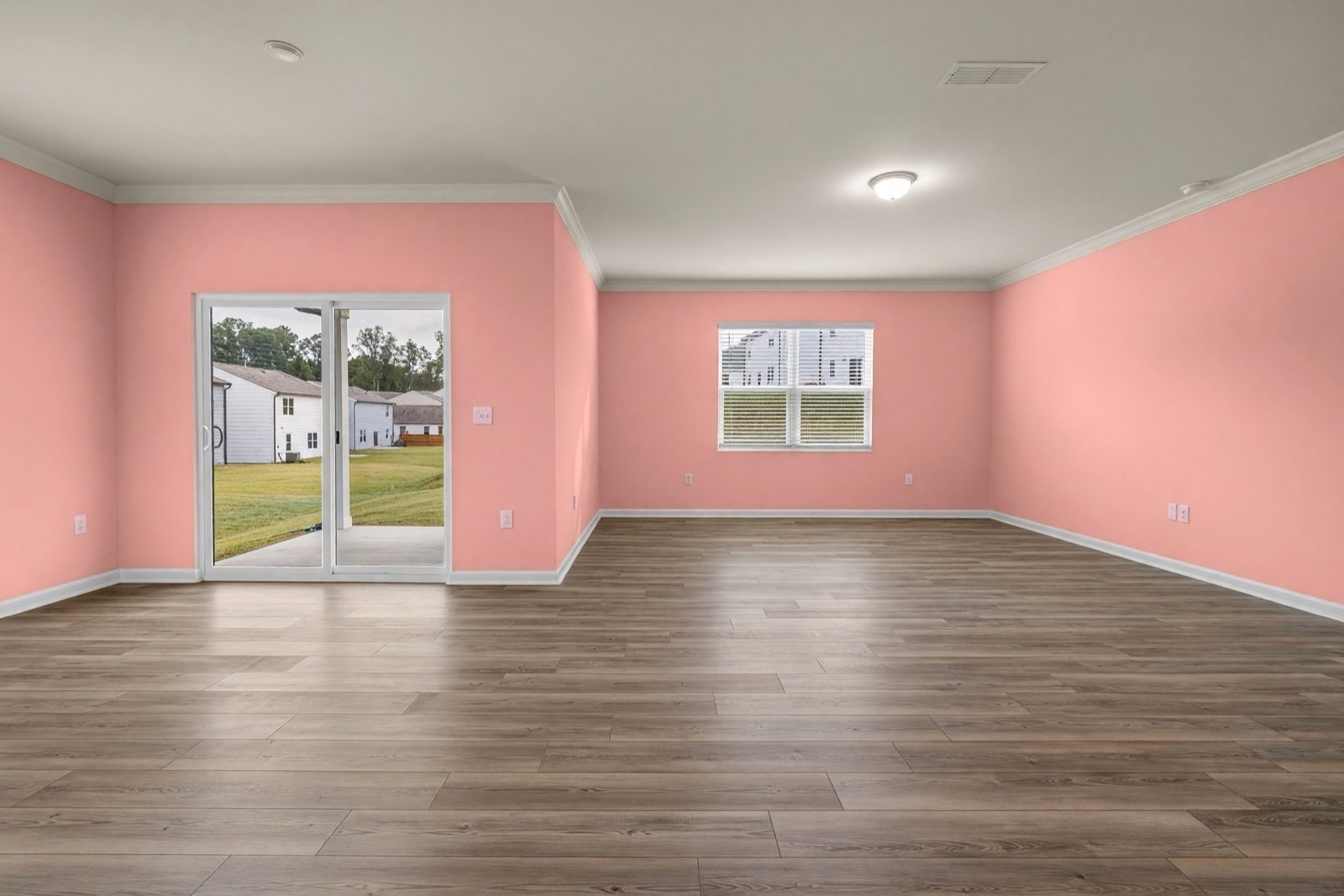
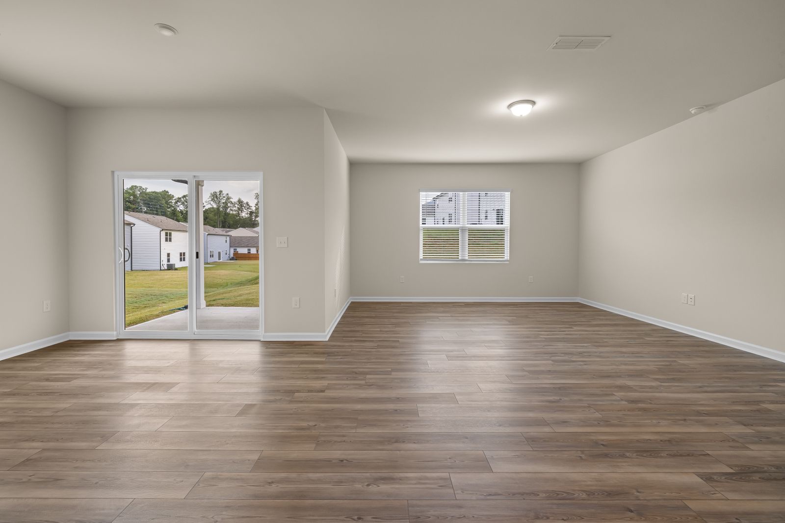
Blush looks warmer and more orange on a wall than on a chip, especially next to a brown floor. Pair it with warm neutrals such as linen, oak and cream, and keep the trim white.
Living room paint colors at a glance
| Color | Works with | Good with this floor | Watch out for |
|---|---|---|---|
| Eucalyptus | Gray or white sofas | Light and mid oak | Can look gray in weak light |
| Ochre | Navy, gray, white | Pale wood | Strong with patterned curtains |
| Mist blue | Brown leather, velvet | Light gray wood | Looks cold on a gray floor with gray sofas |
| Terracotta | Gray, cream, wood | Pale oak | Strong in a room with little daylight |
| Teal | White, brass, wood | Dark wood | Dark in a small room |
| Blush | Linen, oak, cream | Warm brown | Can turn salmon or orange |
What is the most popular color for a living room?
Warm white, soft neutrals and greige-type neutrals are widely used in living rooms, because they sit well with almost any sofa, rug and floor. No single color is the measured winner, and what is popular shifts from year to year. A popular color still has to suit your light: in a room with weak daylight, a warm white can look gray, so check it on your own wall first.
Best light and neutral living room paint colors
A light neutral is the safest place to start, and it makes a room feel more open. The Paint color list has several:
- Chalk white and Porcelain: clean whites; Porcelain is a touch cooler.
- Vanilla cream: a warm white that softens cool daylight.
- Soft sand: a light beige that goes with oak and linen.
- Stone and Warm greige: a mix of gray and beige for mixed woods and gray sofas; Warm greige is the warmer of the two.
A neutral room can look flat, so add interest with texture, not color: a wool rug, linen curtains, wood. Hold each sample next to your floor, because the undertone, warm or cool, shows most against it. Light walls reflect daylight but do not fix a dark room. For a compact room, see small living room ideas.
What color is replacing gray in living rooms?
Lately, living rooms are moving from cool gray toward warmer colors: warm neutrals such as greige and mushroom, soft greens such as sage and eucalyptus, and earthy tones such as clay and terracotta. Trends change, so treat this as a direction, not a rule. Several examples above follow it: white and gray walls became eucalyptus, ochre and terracotta, and the gray sofas stayed calm against them. For more warm, soft looks, see cozy living room ideas.
Modern living room colors
A modern living room usually uses few colors: a light neutral or one muted color on the walls, a matte finish and white trim, with one or two stronger colors in cushions, art or a single wall. The look comes from the restraint, not from one particular shade. If the room already has a lot going on, keep the walls quiet.
Common living room paint mistakes
- Choosing from a small chip. Paint a large sample and look at it for a few days.
- Ignoring the floor and sofa. The wall color must work with the biggest surfaces you already have.
- Skipping the trim. White trim and ceiling make a color look finished; painting everything the same dark color needs a plan.
- A glossy finish. It shows every flaw and reflects glare from the window.
- Painting only one wall by accident. If you want a single feature wall, plan it as one: see accent wall ideas.
Try living room paint colors on your own photo
Upload a photo of your living room to Paint, choose Interior and pick a color from the list. Paint repaints the plain wall surfaces and aims to leave the ceiling, trim, doors, windows, furniture and floor as they are. It usually colors all the walls it can see, though it can miss one; to try a single feature wall, see accent wall ideas.
The result is a design idea, not a paint specification. Colors look different on screen and on the wall, so test a real sample before you buy. For the bedroom, see bedroom paint colors. For a calm, natural look, see Japandi living room ideas.
Frequently asked questions
What is the best paint color for a living room?
One that works with your sofa and floor and suits the light: a warm neutral or soft green for most rooms, a deeper color such as teal or terracotta when the room has plenty of daylight.
Should the walls be lighter or darker than the sofa?
Either works. A lighter wall makes a dark sofa stand out; a deeper wall makes a light sofa stand out. Avoid walls and sofa in the same mid tone.
Can I see a paint color on my own walls before I paint?
You can try it on a photo of your room in HomeCompose Paint as an idea. Then test a real sample on the wall in your own light before you buy.
Is it free to try?
Yes. You can start on the free plan, and it includes a limited number of designs.
Which wall color never goes out of style?
Soft white and warm neutrals such as cream, sand or greige come closest. They stay in the background, so they work when you change the sofa, rug or curtains, and you can add stronger color in cushions or art instead of on the wall.