Wallpaper ideas
Wallpaper ideas come down to three choices: the wall, the look and the size of the pattern. Below are six wallpaper looks on real rooms, before and after, including wallpaper decor for a living room, with where each one works and what to check before you order a roll. The pictures show the look only, not the paper.
What are the main wallpaper looks?
Most wallpaper falls into a handful of looks. Knowing which one you are after makes a sample book much easier to read:
- Botanical. Leaves, palms, branches or flowers, from small sprigs to prints taller than the sofa. It brings a soft, natural feel and suits a wall with little on it.
- Geometric. Diamonds, hexagons, grids and other repeating shapes. A small, regular pattern behaves almost like a texture; a large one is a statement.
- Stripes. Vertical stripes make a ceiling look taller, and wide ones look tailored. They are the least forgiving on a wall that is not straight.
- Damask and traditional. Ornamental motifs in two tones, often cream on a deep color. It gives a room a formal, classic look.
- Textured and linen look. A woven or grasscloth-style surface in a single color. It adds warmth with hardly any pattern to compete with art and furniture.
- Metallic and shimmer. Gold, silver or satin inks that catch the light. They look different by day and by lamp light.
- Murals. One large picture that runs across the whole wall instead of repeating, such as a landscape, a jungle or a sky. A wall mural works best on a wide, empty wall.
6 wallpaper ideas, before and after
Each example starts from a real room photo with a plain wall, shown before and after AI adds wallpaper in Magic Edit (Pro plan). In Magic Edit you describe the change in your own words. For each example the description named one wall, the look, the colors and what had to stay. AI can still redraw small things nearby, so compare each pair closely and treat every result as an idea. The small lettering on a book spine, a doormat, a monitor, a framed certificate and a children's alphabet poster was softly blurred before the redesign.
1. Botanical: a large leaf print behind a living room sofa
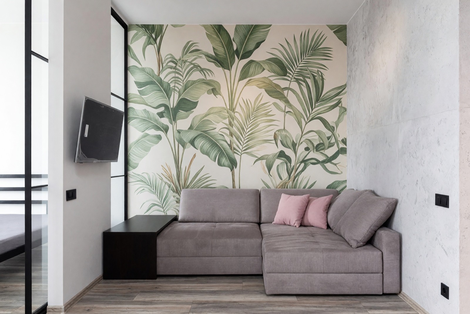
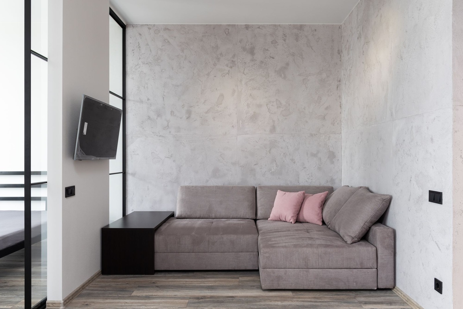
The leaves are bigger than the sofa back and do not visibly repeat, so the wall reads as a mural. That scale needs a wide, clear wall and a quiet room around it, as here, where the gray sofa and the floor stay calm. A print this large can lose half a leaf to a corner or a ceiling line, so on a real roll ask how the panels join and which part of the picture ends up at the top.
2. Geometric: a fine diamond print behind the bed
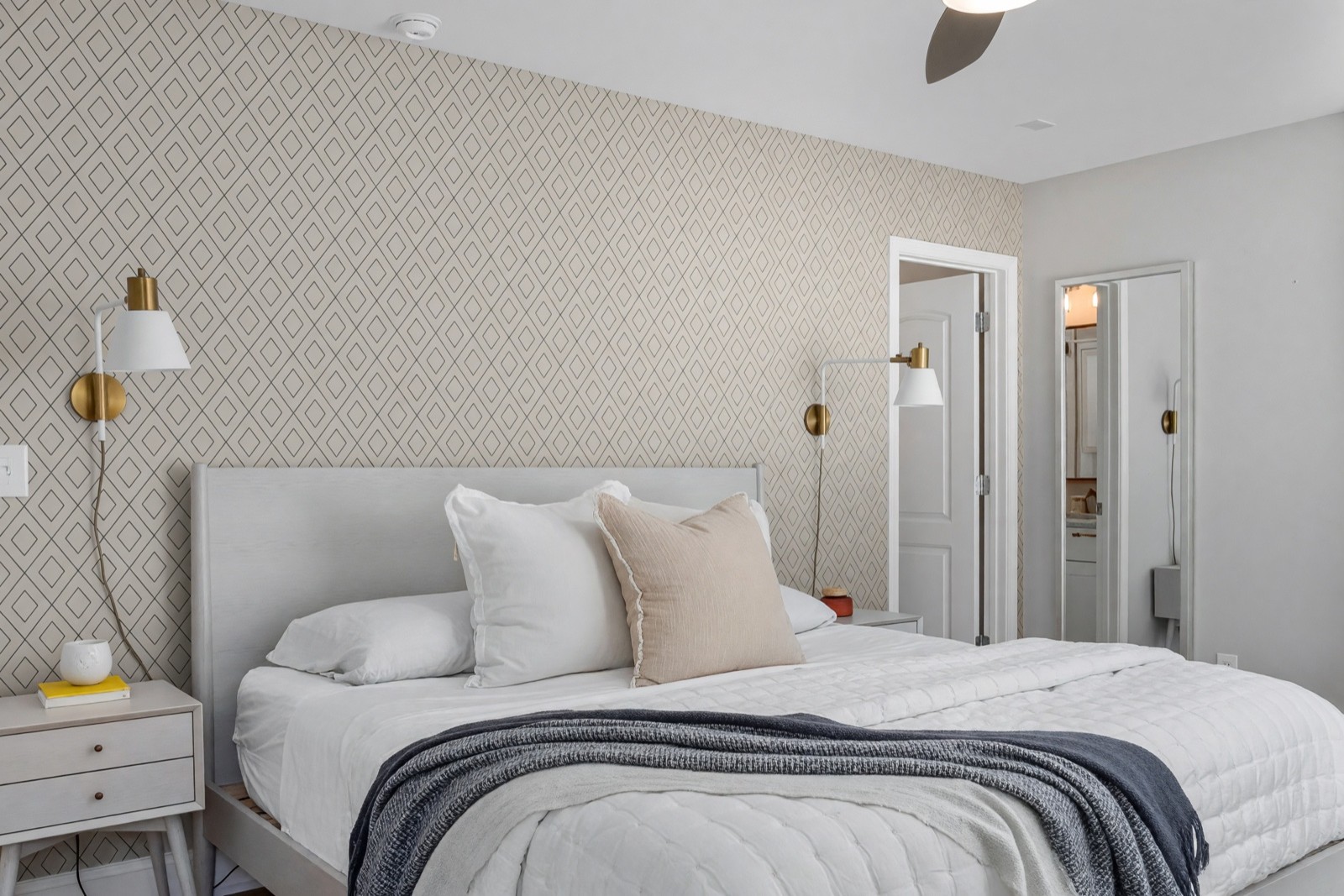
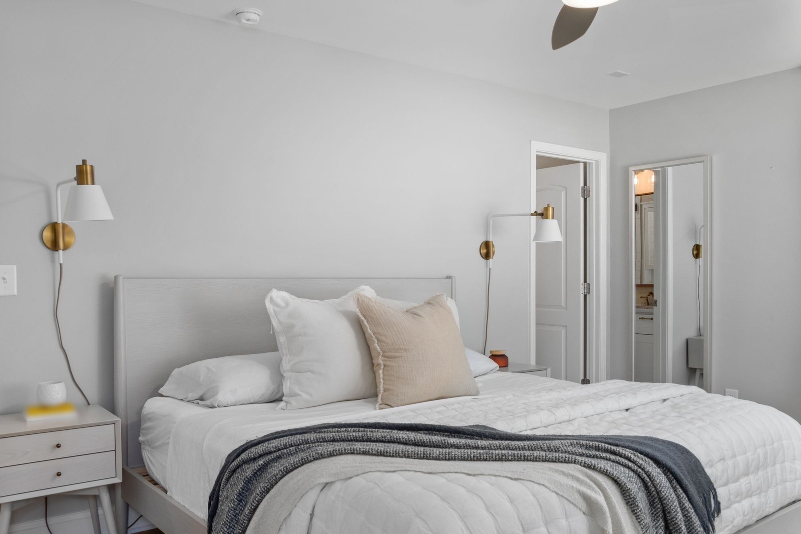
A fine, regular pattern gives the wall texture without pulling attention from the bed, and it copes well with lamps, cords and a headboard in front of it. It stops at the corner, so the side wall with the second doorway stays plain; a pattern that wraps every doorway gets busy. On the real wall, look at how the lines meet across the seams, because a pattern that does not line up shows more than a plain one.
3. Stripes: sage green and cream behind a dining table
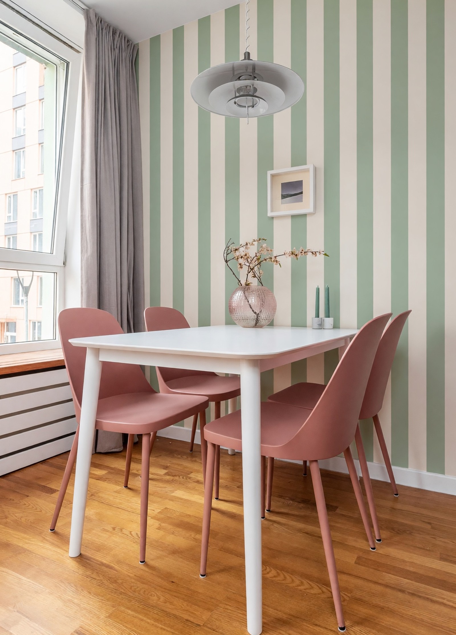
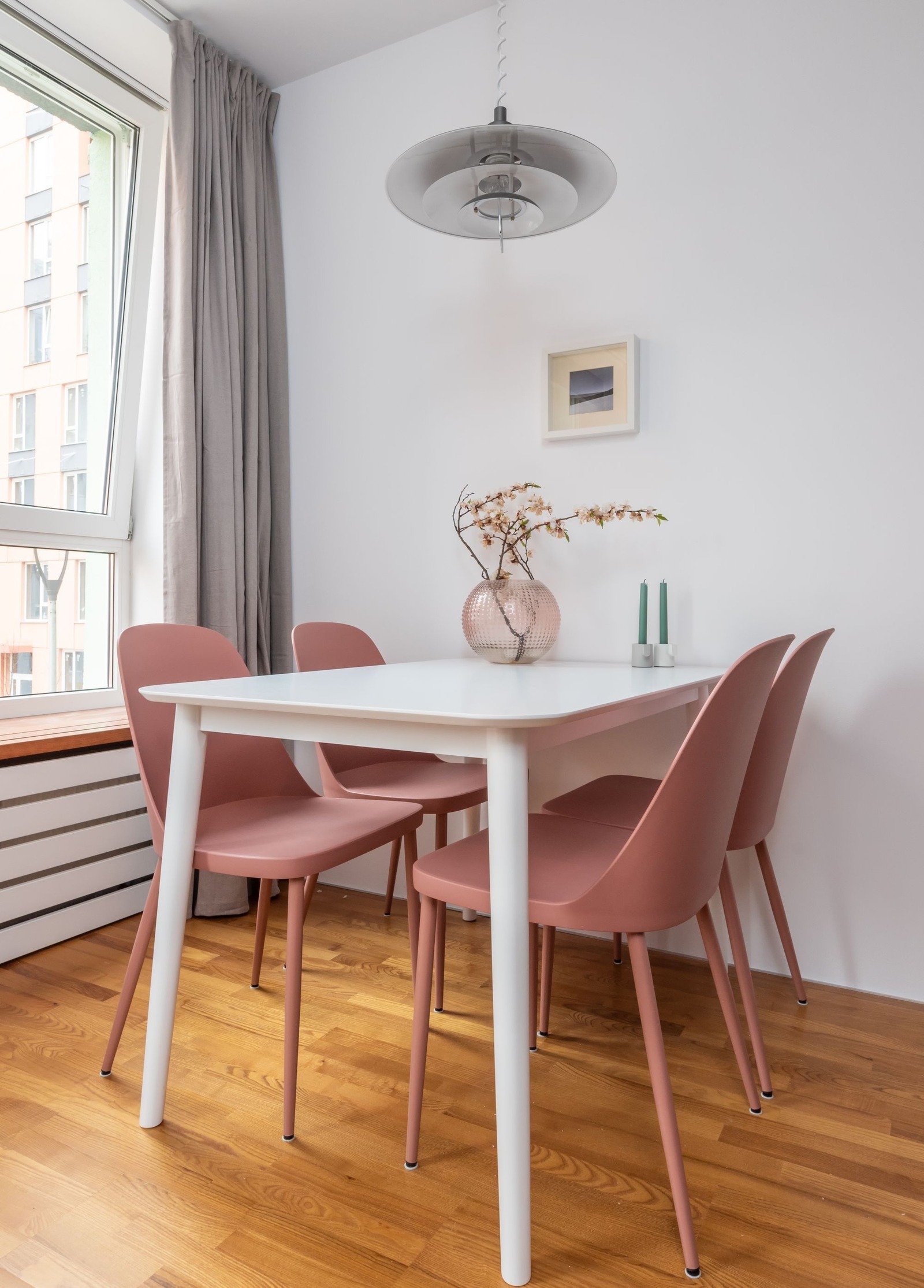
Stripes lead the eye up, which helps in a low or sloped space, and sage green sits well next to dusty pink and warm wood. They also show every flaw: on a real wall, check that the corner and the ceiling line are straight before you commit, because a crooked line is easy to see against a straight stripe. For more dining room looks, see dining room ideas.
4. Damask: a traditional print on a hallway wall
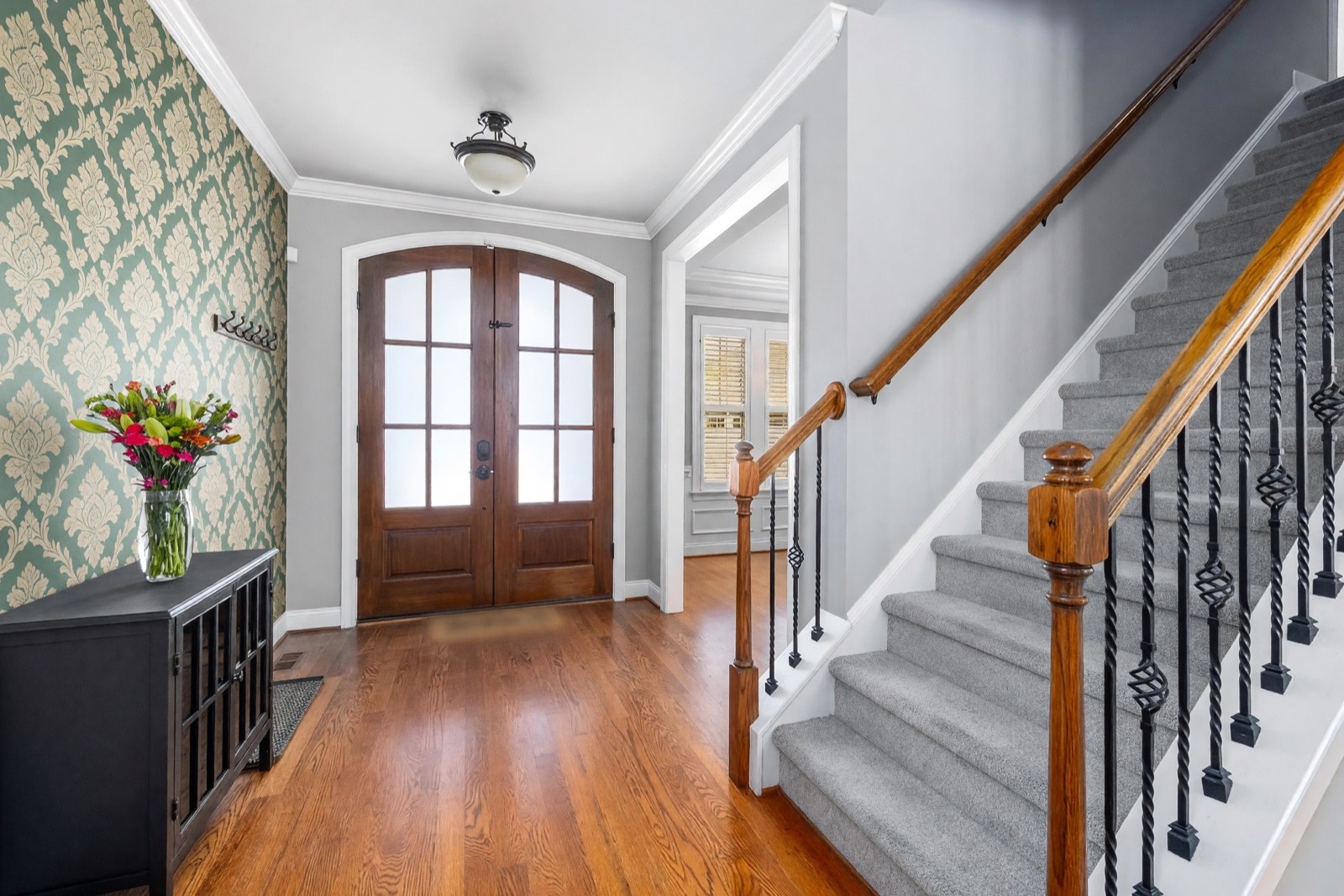
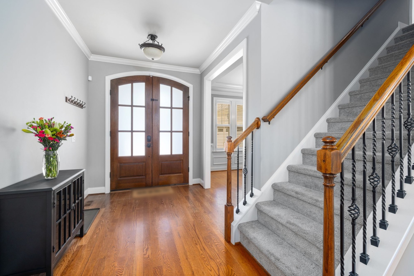
A hallway is passed through, not sat in, so a strong traditional pattern is easier to live with there than in a bedroom. The dark wood door and floor warm the green, and one papered wall is enough. Notice what AI did to the light switch beside the flowers: on a real wall it will still be there, so plan the paper around it.
5. Linen look: a woven sand-colored wall in a home office
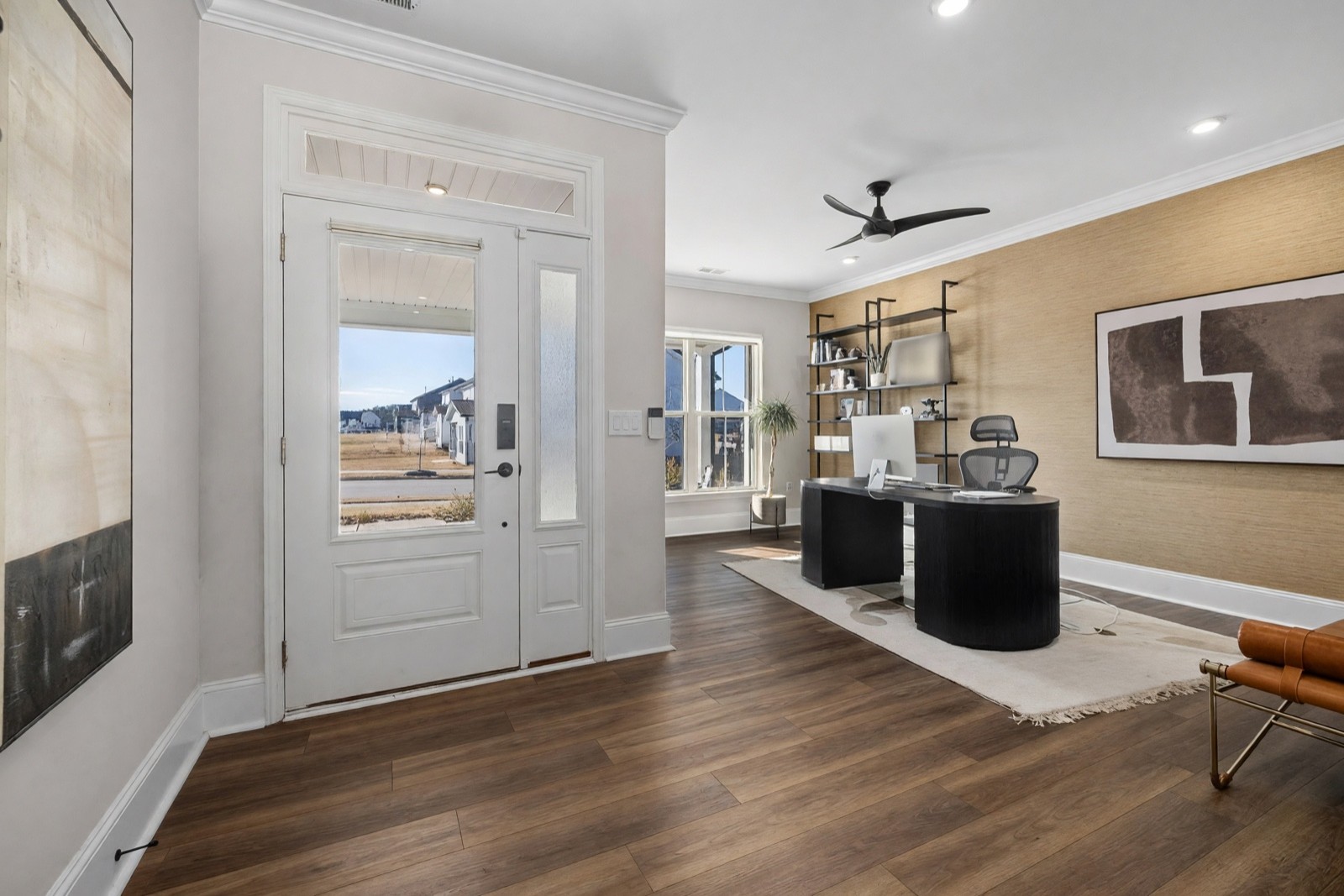
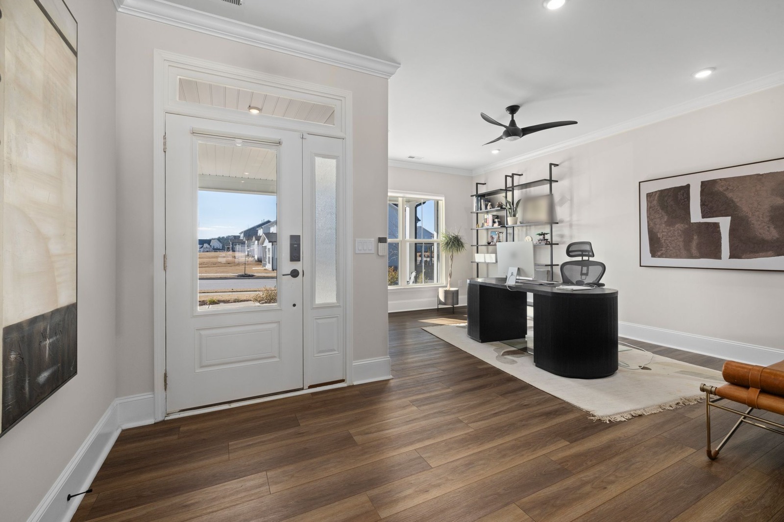
A woven texture in one color adds warmth with almost no pattern, so it sits well behind shelves, art and a screen. Natural-look papers can differ a little in shade from one roll to the next, so look at the sample in daylight and under your lamps, and ask for rolls from the same batch.
6. Metallic: gold art deco fans in a small guest bedroom
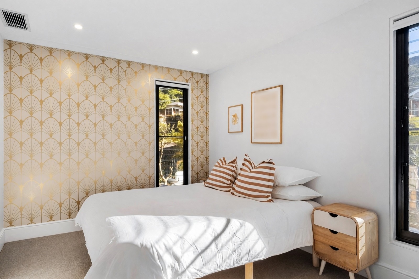
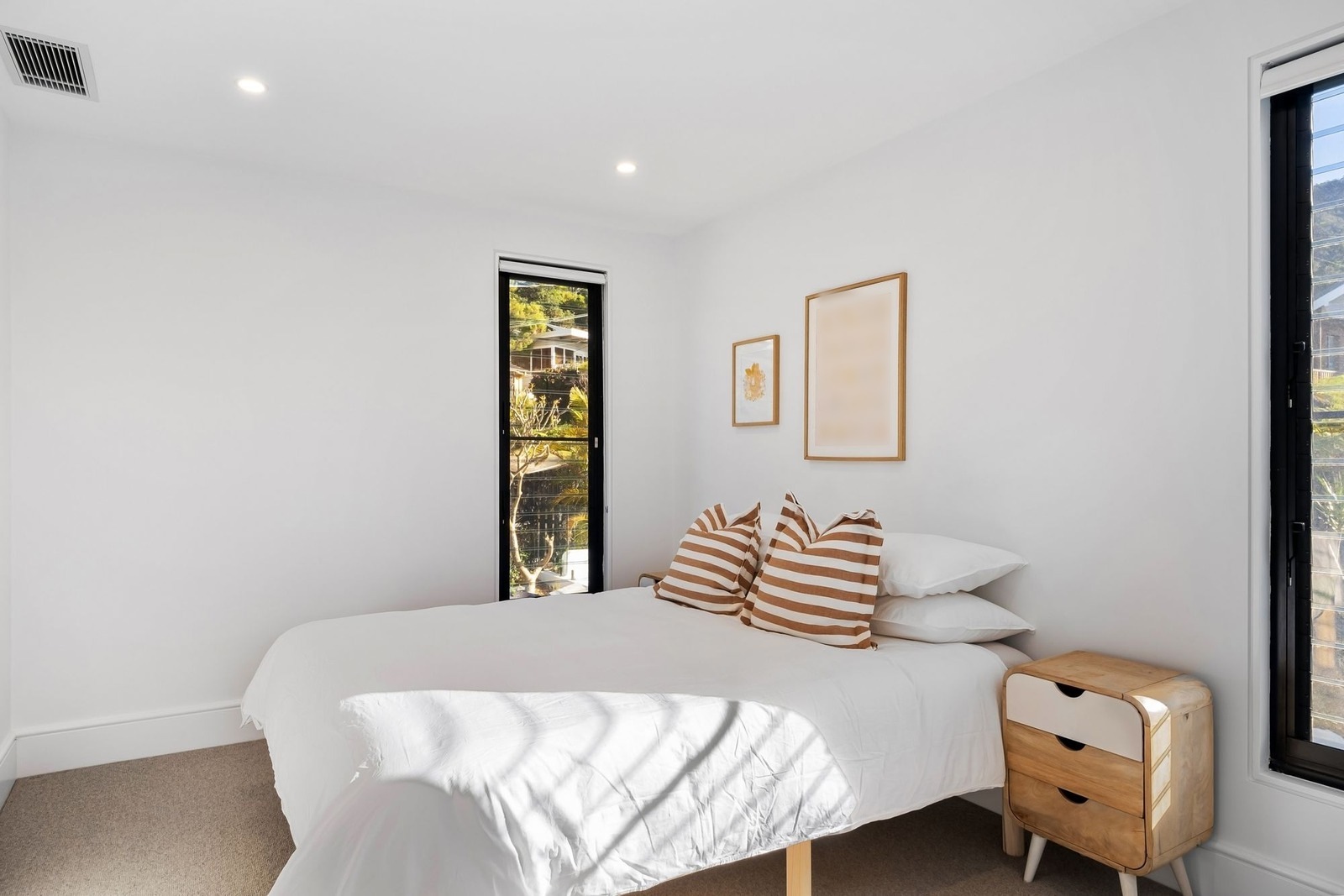
Gold on cream dresses a small room without adding bulk, and it keeps the bed and the white walls as they are. Metallic inks catch the light, so the same paper looks different at noon and at night; check a sample at both times, and remember that a shiny surface can show an uneven wall. The join that appears in this picture is a reminder that the image is an idea: on a real wall, the size of the repeat comes from the roll.
Wallpaper looks at a glance
| Wallpaper look | Best for | What to check |
|---|---|---|
| Botanical or mural | A sofa wall or bed wall with little on it | Large motifs get cut by corners and furniture; ask how panels join |
| Geometric | Bedrooms, offices and small rooms | The pattern must line up across seams |
| Stripes | Dining rooms and low ceilings | Crooked walls and ceiling lines show against straight stripes |
| Damask and traditional | Hallways, dining rooms, formal living rooms | Strong ornament: one wall and calmer furniture |
| Textured, linen look | Home offices and walls behind shelves or art | Shade can differ between rolls; check the sheen in daylight |
| Metallic, shimmer | Small bedrooms and walls with soft light | Sheen can show an uneven wall; look at it by day and at night |
Wallpaper decor for the living room: which wall?
In a living room, wallpaper goes where people look first. That is usually the wall behind the sofa, or the wall you face when you walk in. A few rules of thumb:
- The sofa wall is the classic choice, because a sofa gives the pattern a calm base. Keep the sofa and the cushions simple.
- The TV wall works with a quiet texture or a small pattern. A bold print behind a dark screen competes with it.
- A fireplace wall suits a traditional or metallic look, as long as the paper stays clear of the heat. Check the maker's advice.
- An open-plan living area can use one patterned wall to mark the sitting zone, so the room reads as two spaces.
- Start with one wall. If you like the result, you can repeat a calmer version on another wall.
For smaller rooms, see small living room ideas. Wallpaper is also easy to try in a bedroom, a dining room, a hallway or a home office, as the examples above show. For a hallway in particular, see hallway ideas.
How big should the pattern be?
Scale matters more than the pattern itself. A small print on a large wall can melt into a texture once you step back, and a large print in a tiny room shows only a few leaves of it. A pattern with a large motif needs a wide, clear wall; a fine pattern works behind furniture and lamps.
A simple test: put a sample against the wall, or a printout of the pattern at its real size, and look at it from the doorway. If you cannot tell what it is from there, the motif is probably too small for the wall. If you only see part of one flower, it is too big.
How do color and light change wallpaper?
Wallpaper takes on the light of the room. A pale paper in a bright room can look washed out, while a deep color in a dim room gets heavy. Cool daylight pulls greens and grays toward blue, and warm white bulbs, around 2700 K, bring creams and golds forward. The same paper in the shop, on a screen and on your wall will not match, so judge a sample on the wall itself, in the morning and in the evening.
Wallpaper with paint and paneling
Wallpaper does not have to carry the room alone. Pull one color out of the paper, usually the lightest one, and use it on the other walls. Accent wall ideas shows what a single painted wall does, and living room paint colors helps you choose the colors for the rest of the room.
Paper and panels also work together: paper above, panels below, with a slim rail between, is a classic way to calm a strong pattern. For panel styles and heights, see wall paneling ideas.
What are the wallpaper trends for 2026?
Wallpaper for walls in 2026 is moving toward natural, calm and tactile looks in many collections, but trends change and none of this is a rule. Here, wallpaper means paper for the walls of a home, not a screen background for a phone or a computer. These are the directions you will see in many collections:
- Botanical and nature prints. Leaves, branches and soft florals, as in example 1.
- Textured and grasscloth looks. A woven surface in one color, as in example 5.
- Soft murals. A hazy landscape, sky or watercolor scene across one wall.
- Muted, earthy colors. Sand, clay, olive and sage instead of bright, saturated tones.
- Geometric and arch patterns. Fine grids and diamonds, as in example 2, or rounded arch shapes.
No official ranking sits behind this list, and a trend is a weak reason to pick a wall. Choose the look you expect to still like in five years, and try it on one wall first.
What are the most popular wallpapers?
There is no official top 10 of wallpapers, because no single list counts every shop and every home. What you can rely on is a handful of pattern families that keep turning up in rooms, each with a place where it usually works:
- Stripes for dining rooms, hallways and low ceilings.
- Florals and botanicals for a bed wall or a sofa wall.
- Geometrics for offices and small rooms.
- Textures behind shelves, art or a TV.
- Murals for one wide, empty wall.
Choose by room first, then by light. A pale ground suits a dim room, and a deep color needs a bright one.
Wallpaper for a girl's room
For a girl's room, pick a pattern she can grow with, not one made for a single age. Soft botanicals, fine stripes, small geometrics and gentle murals last longer than characters, and pink is only one option: ask which colors she likes. One papered wall, usually behind the bed, is easy to change later. For more kids' room looks, see boys bedroom ideas, and for the first years, nursery ideas. For wallpaper in a small guest bathroom, see powder room ideas.
How do you get a wallpaper aesthetic?
Pick one mood and keep the palette consistent. Name it in a few words, such as calm and earthy or dark and moody, choose a paper that fits, then pull two or three colors from it for paint, textiles and decor. A second busy pattern fights the first, while a plain texture or a wall color taken from the paper does not. Try the mood on one wall of your own photo before you order a roll.
Other ways to try wallpaper in HomeCompose
Color & Texture (Essential and Pro plans) works the other way round: you select the wall on your photo, then choose a material from the Paper and Cardboard group. The wallpaper materials there are Textured wallpaper, Silk wallpaper, Flocked wallpaper, Metallic wallpaper, Linen wallpaper, Damask wallpaper, Botanical wallpaper, Striped wallpaper and Geometric wallpaper. Each one has a single preset look, whereas Magic Edit lets you describe the pattern, the colors and roughly how large the motifs should be in your own words.
Interior Design restyles the whole room in a style you choose, so walls, furniture and decor change together. For one papered wall, Magic Edit or Color & Texture is the more direct way.
What to check before you order wallpaper
- Measure the wall from the baseboard to the ceiling and from corner to corner, and note every door, window and socket.
- Ask for the pattern repeat. It decides how much paper you need and where the pattern lines up.
- Plan the seams and the corners. Decide where the first strip starts, so a motif is not cut in a bad place.
- Get a sample and look at it on the wall for a few days, in daylight and by lamp light.
- Look at the wall itself. Cracks, bumps and a crooked corner can show through a pattern or a sheen.
- Read the maker's instructions for hanging and care. The picture cannot tell you how a paper goes on, how it comes off, or how it copes with a damp room.
Common wallpaper mistakes
- Papering all four walls with a strong pattern. One wall is usually enough.
- Choosing from a small picture. Look at a large sample on your own wall.
- Picking the wrong scale. A tiny print on a big wall disappears; a huge print in a tiny room does not fit.
- Ignoring what cuts the wall. Doors, windows and shelves break up the pattern, so pick a wall with few of them.
- Ending the paper mid-wall. Stop at a corner or at a trim line.
- Fighting the furniture. A busy paper behind a busy sofa gives the eye nowhere to rest.
Try wallpaper on your own room photo
Upload a photo of the room to Magic Edit (Pro plan) and describe the wallpaper in one sentence: the wall, the look, the colors and what must stay, for example "cover only the wall behind the bed with a fine charcoal diamond pattern on greige, and keep the bed, lamps and doorway exactly as they are". Photograph the wall straight on and in daylight, with the floor and ceiling edges in view. More rooms and styles are on the HomeCompose design ideas page.
The result is an idea of the look, not a drawing. The picture does not set the size of the pattern, the repeat, the seams or the corners, and the AI may redraw small things nearby or change the structure a little, so plan those on a real roll.
Frequently asked questions
Which wall should I wallpaper?
The wall people look at first: behind the bed, behind the sofa, or the wall you face when you walk in. Pick one with few doors and windows, and stop the paper at a corner.
Does wallpaper make a small room look smaller?
Not by itself. A light color or a fine pattern on one wall keeps a small room open, while a dark, large print on every wall makes it feel closed in. Try one wall first.
How do I choose the pattern size?
Match it to the wall. Large motifs need wide, clear walls; fine patterns suit walls with lamps, shelves or furniture in front. Look at a sample from the doorway before you decide.
Can I see wallpaper on my own wall before I buy?
Yes, as an idea. Upload a photo of the wall to HomeCompose and describe the paper in Magic Edit (Pro plan), or select the wall in Color & Texture (Essential and Pro plans) and choose a wallpaper material. The pattern size, repeat and seams come from the real roll, so check a sample before you order.
Is it free to try?
Yes. You can start on the free plan, and it includes a limited number of designs.